Remember the made-up app we wrapped up the first article in this series with? It had 20,000 daily active users, generated 100,000 ad requests a day and, after making its way through the whole funnel, earned €184 a day from ads. Now fast-forward a month. Its developer opens the ad platform dashboard and sees the daily average has climbed to €211.60: up 15%.
Is that good news? Honestly, we can’t tell yet. That 15% could be down to the app having more users. Or to a new interstitial that shows each person more ads. Or to the fact that it’s November and advertisers pay more per impression, as they do every year. Or to a loading bug being fixed that was throwing away ads that had already been sold. All four explanations produce exactly the same number on the dashboard, but each one calls for a completely different response: in one case you leave things alone, in another you keep a very close eye on retention, in another you’d better not take credit for something you didn’t do, and in the last one there’s technical work worth repeating on other screens.
That’s the problem this article tackles. Measuring monetization isn’t the same as looking at daily revenue. Total revenue is the end result of a chain of factors that multiply together, and looking only at the result is like checking your bank balance without seeing the transactions: you know whether you have more or less money, but not why, or what you’ll do next month to keep it growing.
This is the fourth article in our series on ad monetization. In the first one we looked at how the market works and introduced the basic vocabulary: requests, impressions, fill rate, show rate, eCPM, ARPDAU. In the second we chose a monetization model that fits each product. In the third we turned that decision into concrete placements that respect the user’s flow, and we closed with a warning: designing a placement well is only half the job; the other half is checking whether it works.
Here we’ll use those same metrics to build a diagnostic system that answers one very specific question, the one anyone running a product with ads ends up asking sooner or later:
Where am I losing money, and how do I know what to optimize next?
It’s meant both for people who are still deciding whether to monetize their app, website or game with ads and want to know what to measure from day one, and for those who already have ads running and feel their numbers go up and down without quite understanding why. We won’t get into mediation or A/B testing yet: both will get their own article. Before optimizing anything, you need to learn to read the data properly, because an optimization built on a misreading doesn’t just fail to improve things, it can make worse the very thing you weren’t looking at.
The equation behind every euro
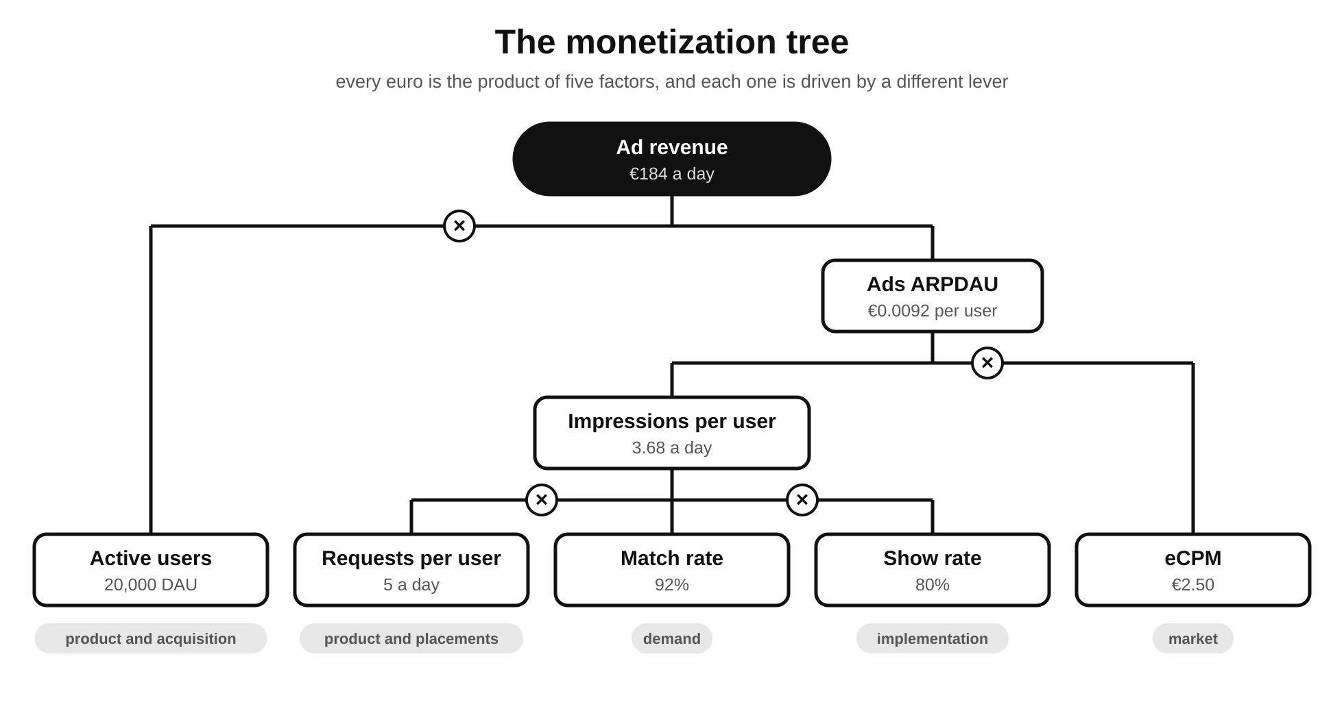
Let’s start with the most important idea in the article, the one everything else follows from. A day’s ad revenue isn’t a standalone number: it’s the product of several factors, and each of them depends on different things.
Ad revenue = active users × requests per user × match rate × show rate × eCPM / 1,000
Applied to our made-up app from the first article:
20,000 DAU × 5 requests per user × 0.92 × 0.80 × €2.50 / 1,000 = €184
The formula may look like a roundabout way of calculating something the dashboard already gives you, but its value isn’t in the result, it’s in the breakdown. Each of those five factors is a different lever, moves for different reasons and, in most teams, is even owned by different people:
| Factor | What it represents | What it mainly depends on |
|---|---|---|
| Active users (DAU) | How many people use the product each day | Acquisition, retention, product quality |
| Requests per user | How many ad opportunities each person generates | Number of sessions, session length, placements and display rules |
| Match rate | What share of those opportunities finds an ad | Available demand, country, format, setup, consent |
| Show rate | What share of matched ads actually gets shown | Technical implementation, load timing, user behavior |
| eCPM | How much is paid, on average, per thousand impressions | Market, geography, platform, format, seasonality, inventory quality |
If we group the three middle factors together, we get a metric worth always having at hand: impressions per active user. In our example, 5 × 0.92 × 0.80 = 3.68 impressions per user per day. Multiply that by the eCPM and you get Ads ARPDAU, the average ad revenue per daily active user:
Ads ARPDAU = impressions per DAU × eCPM / 1,000 = 3.68 × €2.50 / 1,000 = €0.0092
A quick note on naming. Plain ARPDAU includes all the revenue the app generates: ads, subscriptions, in-app purchases and so on. When you only count ad revenue, as in this example, it’s called Ads ARPDAU. Since this article is about advertising, that’s the metric we’ll be using throughout unless stated otherwise.
Seen this way, total revenue boils down to two questions: how many users do I have, and how much does each one bring in? And Ads ARPDAU, in turn, boils down to two more: how many ads does each user see, and how much is each ad worth?
Four ways to earn 15% more
Let’s go back to the €211.60 from the introduction. With the equation in front of us, we can see what would have had to change to reach that number in each of the four scenarios, keeping everything else the same:
| Scenario | What changes | Daily revenue | Ads ARPDAU | What it means |
|---|---|---|---|---|
| A. More users | DAU from 20,000 to 23,000 | €211.60 | €0.0092 (same) | Monetization hasn’t improved; the product has grown |
| B. More ad pressure | Requests per user from 5 to 5.75 | €211.60 | €0.0106 | Each user brings in more, but you need to check they keep coming back as before |
| C. Better prices | eCPM from €2.50 to €2.875 | €211.60 | €0.0106 | Could be seasonality: it probably won’t last |
| D. Better implementation | Show rate from 80% to 92% | €211.60 | €0.0106 | Ads that were already sold are no longer being lost: a solid, repeatable gain |
All four rows end up with the same revenue, and three of them even with the same Ads ARPDAU. But reading each one correctly leads to opposite decisions. In scenario A there’s nothing to celebrate from a monetization standpoint, though there is from a product one. In B, the increase may be a trap if retention has dropped a month from now. In C, anyone who credits the jump to something they changed that same week will end up convinced it worked, when all that really happened is that the holiday season arrived. And in D there’s a technical lesson that can probably be applied to other placements in the app.
That’s why total revenue, on its own, is the least useful metric for making decisions: it’s the one that depends most on everything else. The rest of the article is really about learning to look at each of those factors separately, knowing what it means when one moves and what to do when it does.
The full funnel, stage by stage
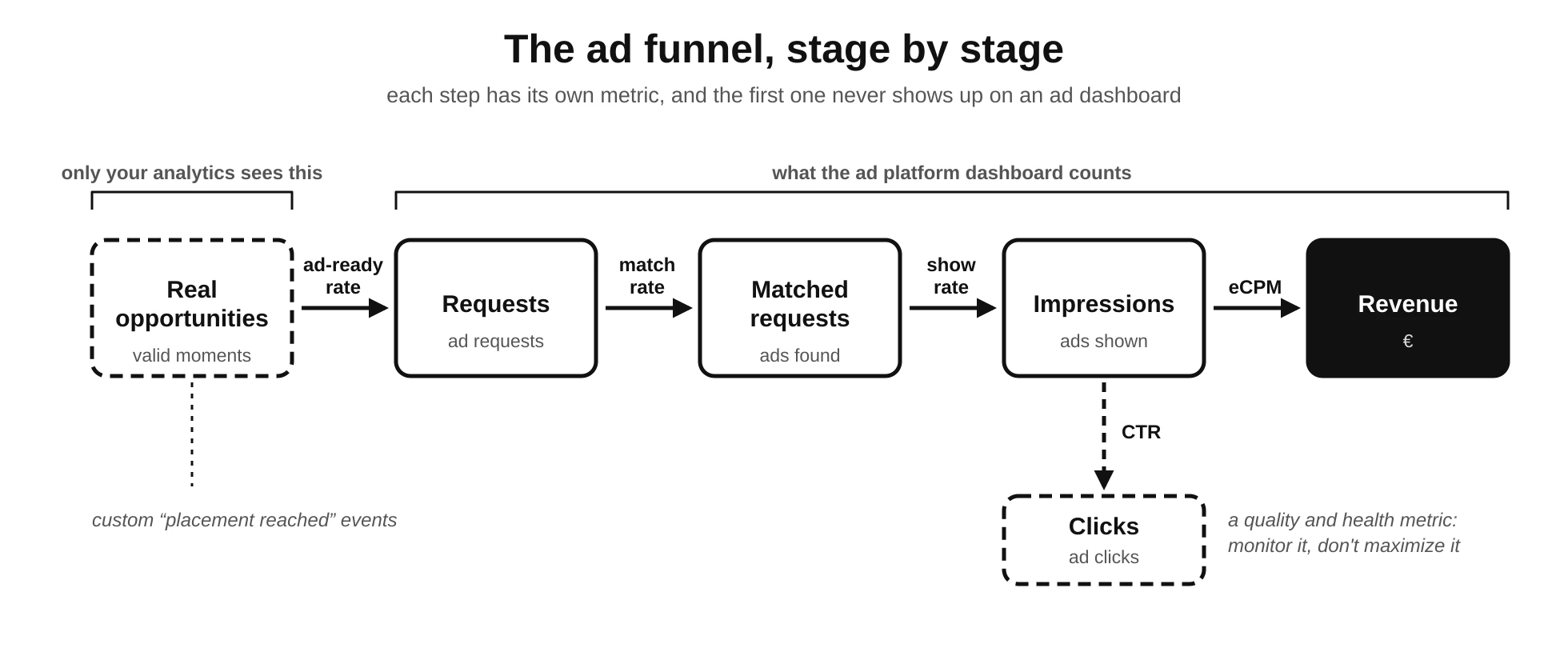
In the first article we presented the ad funnel as a journey: request, matched request, impression, click. Now we’ll walk through it again, but with a different question in mind: if this particular stage breaks, how do I spot it, and what’s usually behind it?
Before the request: the opportunities the dashboard can’t see
There’s one stage of the funnel that almost nobody measures, even though it comes first. Every ad platform dashboard starts counting the moment the app makes a request. But before that, there’s something only the app itself knows: how many times the user reached a point where an ad could have been shown.
Take the end-of-level interstitial from the previous article. If a thousand users finish a level, there are a thousand potential opportunities. Some won’t be used by design—the display rule says it’s too soon since the last ad, or the user is in their first session—and that’s fine. But others will be lost for reasons nobody chose: the ad hadn’t loaded in time, it had expired, or the preload never even fired. None of those losses show up on the ad dashboard, because as far as it’s concerned, nothing happened.
The only way to see them is to instrument them in your own product analytics, with a custom “placement reached” event that records why the ad was or wasn’t shown: shown, blocked by frequency cap, blocked by a “remove ads” purchase, no consent, no ad available. With that event you can calculate something no ad platform gives you: the percentage of valid moments that had an ad ready. If it’s low, the problem isn’t demand or price but when and how ads are preloaded, and that’s usually one of the cheapest things to fix.
Requests and matched requests
The next stage goes from the request (ad request) to the matched request, and it’s measured with match rate or fill rate: the percentage of requests that found an ad.
match rate = matched requests / requests × 100
A low match rate means the app is asking for ads the market isn’t serving. The most common causes are:
- Geography. In some countries there’s simply little ad demand for apps, or little for a particular format. A mediocre overall match rate can hide an excellent one in your main markets and a terrible one in a region with lots of traffic and few advertisers.
- Format. Not all formats attract the same demand. Video, rewarded or native ads with specific requirements may have fewer buyers available than a standard banner.
- Consent and privacy. When users don’t consent to personalized ads, or on iOS when they don’t allow tracking, part of the demand stops bidding or bids lower. We’ll cover this in depth in the article on privacy, but it’s worth knowing now that a change to your consent form can visibly move your match rate.
- New app or account. Platforms usually review new apps before serving them full demand. In AdMob, for example, a newly added app may have limited ad serving until that review is complete. Not having an
app-ads.txtfile published doesn’t help either: it lets buyers verify that the inventory they’re being offered really belongs to whoever claims to be selling it. - Setup. Floor prices set too high, overly broad advertiser category restrictions or misconfigured ad units all reduce the demand that can compete for each opportunity.
- Inflated requests. An app that retries in a loop when there’s no ad, or refreshes banners that aren’t on screen, generates lots of requests that are unlikely to be filled. Match rate drops, not because demand is missing, but because the implementation itself is inflating the denominator.
There’s an important caveat: a higher match rate isn’t always better. If you accept ads at any price to reach 99% fill, part of your impressions may be selling very cheaply. There’s a balance between filling more requests and getting paid more for each one, and managing it is precisely one of the jobs of mediation and floor prices, which we’ll cover in the next article. For now, it’s enough to know that match rate should never be read on its own, but always alongside eCPM.
Impressions and show rate
Finding an ad doesn’t mean anyone will see it. Show rate measures what share of matched requests actually turns into a real impression:
show rate = impressions / matched requests × 100
This stage is, by far, the one that depends most on your own implementation, and the one most closely tied to everything we covered in the previous article. A low show rate usually comes down to one of these causes:
- Loading or rendering errors. An ad was found, but the creative couldn’t be downloaded, or it failed to draw on screen.
- The user leaves first. They left the screen, switched tabs or closed the app before the ad got a chance to show. On screens people pass through very quickly this is almost unavoidable, and it may be a sign the placement is in the wrong spot.
- Preloaded ads that never get used. This is the most common cause with full-screen formats. If you preload an interstitial at the start of every game but only a third of users finish it, two out of three loaded ads will never be shown.
- Expired ads. As we saw in the previous article, loaded ads have a shelf life: in AdMob, one hour for an interstitial and four for an app open ad. If the app preloads too early, many ads expire before their moment comes.
- Lifecycle issues. Ads requested while the app is in the background, in tabs that aren’t active or behind modal dialogs.
Show rate should be read in light of the format. For a banner that’s requested once the screen is already visible, it should be high, and if it isn’t, there’s almost certainly a technical problem. For a preloaded interstitial or rewarded ad, a lower show rate can be normal, because it reflects how often users actually reach the intended moment. What isn’t normal is for that figure to drop from one app version to the next without anyone having changed anything on purpose: that usually means something broke in the loading or display logic.
And there’s one last step, which we already covered in the previous article: an impression being counted doesn’t mean the ad was seen. Viewability measures what share of impressions met the minimum exposure standard, and low-viewability inventory ends up being paid less even when the show rate is spotless.
Clicks, CTR and conversions
CTR (click-through rate) measures the percentage of impressions that lead to a click. It’s probably the most misunderstood metric in all of ad monetization, because intuitively it seems like more clicks should mean more money.
From the publisher’s point of view, that’s not the case, for several reasons. First, even though some advertisers buy on a per-click or per-install basis, platforms convert those bids into an expected value per impression so they can compare them with everything else in the auction. What the publisher ends up getting is captured by eCPM, not by the number of clicks. Second, the advertiser’s goal isn’t the click, it’s what happens next: the install, the sign-up, the purchase. If the clicks your inventory generates don’t convert, buyers learn that over time and bid less for it. A high CTR with low conversions is, in the medium term, inventory that’s losing value.
The third reason is the most important: an abnormally high CTR is usually a bad sign, not a good one. It almost always points to accidental clicks: a banner jammed against the navigation bar, a native ad whose whole card is tappable, a close button that’s hard to hit. Platforms watch for this pattern because it’s the classic fingerprint of invalid activity, and an out-of-the-ordinary CTR can end in clawed-back revenue, limited ad serving or a suspended account. So if a placement’s CTR suddenly spikes after a design change, the first question isn’t “how much are we going to make?” but “what did we put next to the ad?”.
In other words, CTR is a quality and health metric, not a performance one. You monitor it to catch problems, not to maximize it. And, as we’ve warned in previous articles, never, under any circumstances, click on real ads in your own app to “test” anything.
Financial metrics: eCPM, revenue, Ads ARPDAU and LTV
So far we’ve measured volume: how many opportunities there are and how many get used. Now it’s time to measure value: what the opportunities we do use are worth, and how that translates into money per user.
eCPM: an average that’s easily misleading
We already know eCPM:
eCPM = revenue / impressions × 1,000
It’s the most shared metric, the one people ask about most in forums (“what eCPM are you all getting?”) and probably the one behind the most bad decisions. Not because it’s calculated wrong, but because it’s an average, and averages hide what they’re made of.
An example makes it clear. Imagine an app with users in two markets: Spain, where eCPM is around €3, and another country with lots of traffic but little ad demand, where it’s around €0.50.
| Month 1 | Month 2 | |
|---|---|---|
| Impressions in Spain | 10,000 at €3.00 → €30 | 10,000 at €3.20 → €32 |
| Impressions in the other country | 10,000 at €0.50 → €5 | 30,000 at €0.55 → €16.50 |
| Total | 20,000 impressions, €35 | 40,000 impressions, €48.50 |
| Overall eCPM | €1.75 | €1.21 |
Overall eCPM has dropped 31%. If that were the only number we looked at, we’d conclude monetization had gotten seriously worse. But eCPM actually went up in both countries, and revenue grew by almost 40%. The only thing that changed is the share of impressions coming from each market. This is called the mix effect, and it’s why an overall eCPM should almost never be used to make decisions without breaking it down first.
Something similar happens with formats. A rewarded ad almost always has a much higher eCPM than a banner, which leads many teams to conclude that “rewarded performs better”. But a banner can generate dozens of impressions per user per day, while rewarded generates one or two at best, and only among users who choose to watch. Comparing formats by eCPM is like comparing unit prices for products sold in wildly different quantities. The useful comparison is a different one: how much revenue each placement brings in per active user, that is, that placement’s revenue divided by DAU. For rewarded ads it’s also worth looking at what percentage of users watch at least one a day and how many times each of them does, because it’s a format that relies entirely on users wanting to use it.
Finally, a high eCPM can hide a volume problem. If raising floor prices takes eCPM from €2 to €3 but cuts match rate in half, you earn less with a better eCPM. Whenever eCPM goes up, the next question should always be: and what happened to impressions?
Total revenue: separating growth by where it comes from
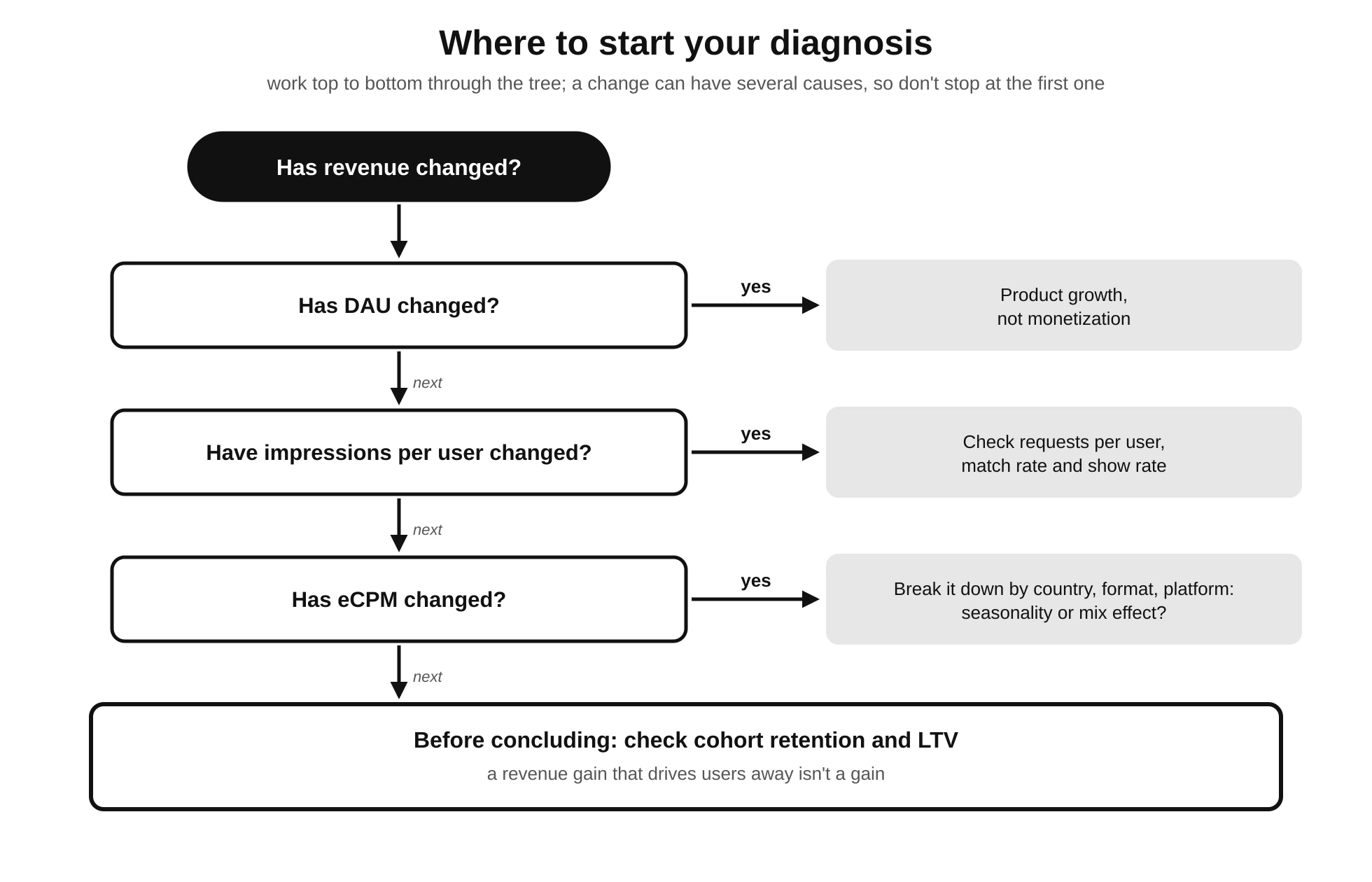
With the equation from the start, any change in total revenue can be broken down into its causes. In practice, when revenue changes significantly, it’s worth always asking the same questions, in this order:
- Have active users changed? If DAU has grown in the same proportion as revenue, monetization hasn’t changed. The product has grown.
- Have sessions per user changed? More sessions create more opportunities without touching anything ad-related. It’s usually good news, because it means more usage.
- Have impressions per session changed? If so, someone has changed placements, frequency rules or how loading works under the hood. This is where you need to keep an eye on the experience.
- Has fill changed? Match rate and show rate: are existing opportunities being used better or worse?
- Has price changed? eCPM, broken down by country, platform and format to rule out the mix effect.
Running through this takes ten minutes with a well-set-up dashboard, and it heads off most wrong conclusions.
Ads ARPDAU and ad ARPU: tying money to people
eCPM talks about inventory: what every thousand ads is worth. Ads ARPDAU talks about people: how much each active user brings in every day. It’s a fundamental shift in perspective, because product decisions are made about users, not impressions.
Ads ARPDAU has a huge advantage over eCPM: it captures price and quantity at the same time. If a decision raises eCPM but cuts impressions per user by the same proportion, Ads ARPDAU doesn’t move, and that’s exactly what you need to know. That’s why, if you have to pick a single ad metric to track day to day, Ads ARPDAU is a better candidate than eCPM.
Ad ARPU is the same idea over a longer period, usually a month: ad revenue for the period divided by the period’s active users. It’s useful for comparing months or for planning, but it has a drawback: it lumps together users who opened the app once with users who open it every day.
And for products with a hybrid model, as we saw in the second article, it’s worth always tracking both versions of the metric: Ads ARPDAU, from ads alone, and ARPDAU, which also includes purchases and subscriptions. A decision that raises the first can lower the second if, for example, new ads cannibalize purchases. And the other way round: a bit more ad pressure can boost “remove ads” purchases and lift the total even as ad revenue dips. Looking at only one of them means looking at half the business.
Ad LTV: value that builds up over time
Ads ARPDAU measures what a user brings in on a single day. LTV (lifetime value) measures what they bring in over their entire relationship with the product. We introduced it in the first article and will devote a whole one to it later on, when we talk about business strategy, but there’s a simple way to think about it that’s enough for now:
ad revenue per user over N days ≈ average Ads ARPDAU × average active days in those N days
A user with an Ads ARPDAU of €0.0092 who opens the app, on average, on 6 of their first 30 days brings in about €0.055 in that first month. One with an Ads ARPDAU 15% higher, but who only opens it on 5 days, brings in about €0.053. The second one generates more money every day they use the app, but less money overall.
In practice, ad LTV isn’t calculated with this approximation but by cohorts. A cohort is a group of users who started using the product in the same period—for example, everyone who installed the app in the same week—and who are tracked over time as a group. For each cohort you add up everything its users have generated 7, 30 or 90 days after install, which lets you compare groups that are at the same stage of their relationship with the product. To do that, ad revenue needs to be tied to users in your analytics tool, not just aggregated in the network’s dashboard. Many platforms make this possible through impression-level ad revenue: in AdMob’s case, by linking it to Google Analytics for Firebase, each impression can be logged as an event with its estimated value, so you can cross revenue with cohorts, versions or behavior. If you’re just getting started, turning it on from day one is one of the best time investments you can make, because data you don’t collect today can’t be recovered later.
The product metrics that should sit alongside your ad metrics
Everything so far measures advertising. But, as we’ve been saying since the first article in the series, ads live inside a product, and the product has its own metrics, which are the ones that decide whether, three months from now, there will still be users to show ads to.
These are the ones worth always tracking alongside your ad metrics:
- D1, D7 and D30 retention. What percentage of users who installed the app on a given day open it again 1, 7 and 30 days later. It’s the metric that most directly reveals whether ad pressure is driving users away. D1 usually reacts first to a bad first experience, such as an app open ad in the very first session; D7 and D30 react to accumulated fatigue.
- Session length. If it drops after a new format is introduced, users may be leaving earlier to avoid it.
- Sessions per user and usage frequency. How often each user comes back, per day or per week. Remember that repeat usage is the foundation of all long-term ad revenue.
- Drop-off at specific points. Which screens or moments people leave at. If a placement lines up with a drop-off spike, the correlation is worth looking into.
- Uninstalls. Harder to measure precisely, but the store consoles provide aggregated data, and a rise after a release with more ads is a clear signal.
- Ratings and reviews. Not a fine-grained quantitative metric, but mentions of “too many ads” are an early warning that usually comes before retention drops.
- Purchases, subscriptions and users who remove ads. In hybrid models, how many users convert to paying, and how many do so specifically to get rid of ads.
The key idea of this section fits in one sentence: an ad setup can improve Ads ARPDAU and hurt a user’s total value. That’s scenario B from the table at the start. Daily revenue goes up and the ad dashboard celebrates, while retention slowly slips on a different dashboard that someone else might be watching, or that nobody is. By the time it shows up in DAU, weeks have gone by and it’s hard to tell what caused it.
That’s why, every time you change something about your ads, you need to decide up front which product metrics you’ll watch to make sure nothing broke. You don’t need a formal experiment for this—we’ll get to that in the article on experimentation—but you do need to be clear that the success of an ad change isn’t measured with ad metrics alone.
How to read the monetization tree
We now have all the pieces: the equation, the funnel, the financial metrics and the product metrics. Let’s bring them together into the most practical tool in the article: a table of symptoms and likely causes to help you get your bearings when something doesn’t add up.
| Symptom | Possible problem | What to check first |
|---|---|---|
| Lots of requests, few matched | Insufficient demand, geography, format, setup, consent or inflated requests | Match rate by country and format; whether there are retries or off-screen refreshes |
| Lots matched, few impressions | Loading errors, users leaving the screen, unused preloads or expired ads | Show rate by format and app version; loading errors in analytics |
| Valid moments with no ad ready | Late preloading, expiry or initialization failures | Custom placement-reached event vs. impressions |
| Lots of impressions, low eCPM | Market, country, platform, format, seasonality or low viewability | eCPM broken down; comparison with the same period last year |
| Good eCPM, little revenue | Low user volume or few impressions per user | DAU, sessions per user and impressions per user |
| Overall eCPM falling while eCPM by country holds steady | Mix effect: the traffic’s origin is shifting | Impression split by country and platform |
| Unusually high CTR | Accidental clicks, placements next to controls, risk of invalid activity | CTR by placement; recent design changes |
| More impressions, lower retention | Too much ad pressure or ads at the wrong moment | Cohort retention before and after the change |
| Good Ads ARPDAU, worse LTV | Short-term monetization at the expense of repeat usage | Cumulative revenue per cohort at 30 and 90 days |
| Ad revenue up, total revenue down | Cannibalization of purchases or subscriptions | ARPDAU vs. Ads ARPDAU |
| Big differences between countries | Differences in demand, behavior and traffic quality | Every funnel metric, country by country |
| SDK, analytics and dashboard don’t match | Differences in definitions, time zone, currency or later adjustments | See the next section |
The table is useful, but the reasoning behind it is even more so. Whatever the symptom, the reading order is always the same: top to bottom through the funnel, and from general to specific across segments. First check whether user volume has changed. Then opportunities per user. Then fill and show rate. Then price. And only at the end, with all of that ruled out, go looking for subtler causes. Starting with eCPM, which is what almost everyone does, tends to send you looking for the problem in the market when it was in the implementation, or the other way round.
When the numbers don’t match
Sooner or later, anyone who looks closely at their data discovers that the ad network dashboard, the mediation dashboard and the product analytics don’t show exactly the same figures. That’s normal, and it’s worth knowing why before you lose an afternoon hunting for a bug that doesn’t exist:
- Different definitions. One platform may count an impression when the ad starts rendering and another when it’s considered viewable. The same goes for requests: the mediator counts one request from the app, but each network taking part may count its own.
- Time zones. If the ad dashboard runs on one time zone and analytics on another, the “days” don’t line up, and daily comparisons jump around.
- Currency and exchange rates. Networks may report in dollars and convert using exchange rates from different moments.
- Estimated vs. finalized revenue. As we saw in the first article, revenue for the last few days is an estimate. Figures are usually finalized early the following month, when, among other things, traffic the platform considers invalid is deducted.
- Events that never arrive. Users who close the app before analytics sends its events, blockers, or users who haven’t consented to analytics.
Small, steady differences between sources are to be expected and generally nothing to worry about. What is a red flag is the gap suddenly changing, for example after shipping a new release: that usually means an event has stopped being logged or something is being counted twice. That’s why it’s more useful to watch how stable the discrepancy is than to try to make it go away.
The minimum segmentation to avoid mixing up data
The eCPM-by-country example has already shown the danger of overall averages. Let’s generalize it: almost any aggregated metric hides segments that behave differently, and an improvement in one segment can be cancelled out, or amplified, by what’s happening in another.
At a minimum, every metric in this article should be available broken down by:
- Country or region. It’s the factor that introduces the most variation in eCPM and match rate, and the biggest source of mix effect.
- Platform. iOS and Android have different demand, prices, privacy policies and even technical bugs. A loading failure that only affects one of them can get diluted in the average.
- App version. Essential for catching regressions: if show rate drops only in the version released on Tuesday, you know where to look.
- Format. For the reasons we’ve covered: each format has its own reasonable ranges for eCPM, match rate and show rate.
- Placement. The same format can work really well at one point in the flow and really badly at another. If all your interstitials share a single ad unit, there’s no way to tell which one is working.
- Install cohort. Users who came in through a particular campaign, or in a particular week, can behave very differently from everyone else.
- New vs. returning users. Someone in their first week tolerates ads differently from someone who’s been using the app for months, and brings in a different amount of value.
A typical case: after an update, overall Ads ARPDAU holds steady and nobody pays it much attention. Broken down by platform, it turns out it’s up 10% on Android thanks to a preloading improvement, and down 10% on iOS because that same improvement introduced a bug that stops the app open ad from showing. The average says nothing happened; the segments say there’s an improvement to keep and a bug to fix.
There’s a practical takeaway from all this that’s worth applying from the start: create a separate ad unit for each placement, even when they share a format. It’s the simplest way for the platform’s dashboard to break down performance by placement without needing extra tools. You can reorganize later, but you lose the historical continuity of your data.
Cohorts and comparisons over time
The most common way to evaluate monetization is to compare this month with last month. It’s also one of the most misleading, because a lot of things change at once from one month to the next, and most of them have nothing to do with advertising:
- Seasonality. As we saw in the first article, ad demand isn’t constant throughout the year. It tends to climb sharply in the last quarter, with Black Friday and the holiday season, and fall in the first weeks of January, when advertisers reset their budgets. Comparing December with January without taking this into account leads you to think something broke.
- Changes in acquisition. A marketing campaign in a new country, a featured spot in the store or an article linking to you all bring in users who behave differently from your usual base.
- Version changes. Each release can change the flow, ad loading or the experience.
- User mix. Over time, the proportion of long-time and new users shifts, and every average metric shifts with it.
- Consent or privacy changes. A new consent form, a change in operating system policies or new regulations in a region can move match rate and eCPM without you touching a thing.
The tool for guarding against all of this is the cohorts we introduced when talking about LTV: groups of users who share a starting point, usually the week or month they installed. Instead of asking “how much did we make this month?”, you ask “how much did the group that installed in September generate in its first 30 days, compared with the one that installed in August?”. That way you’re comparing users at the same stage of their relationship with the product, not a mixed group whose makeup changes every month.
Two more habits, simple and very worthwhile. First, whenever possible, compare with the same period last year as well as with the immediately preceding period, at least for price metrics. Second, keep a dated changelog: releases shipped, ad setup changes, acquisition campaigns, consent changes. It can be a simple spreadsheet or annotations in your analytics dashboard. When a metric does something odd three months from now, that log will be the first thing you’ll want to check, and the only thing that will let you tell cause from coincidence.
What to watch in the first 7, 30 and 90 days
If you’ve just integrated ads, or just made a major change, not every metric makes sense from day one. Some need volume to settle down, and others simply need time to exist: you can’t measure 30-day retention for a cohort that installed a week ago. Here’s a sensible way to split your attention:
First 7 days: make sure everything works. This is the phase for checking the setup, not performance. Watch for loading errors, check that each format’s show rate is within reasonable values, that analytics events are coming through and roughly match the ad dashboard, and that the display rule behaves as designed: users who paid to remove ads don’t see any, two ads never appear back to back, and consent is respected. eCPM figures from this first week aren’t very reliable, because demand is still adjusting, especially if the app is new.
First 30 days: make sure the numbers make sense. With a month of data you can read eCPM, match rate and Ads ARPDAU with some stability, and above all break them down by country, platform, format and placement. It’s the time to identify which segments and placements are working and which aren’t, and to check that there are no unexplained differences between platforms or versions. You’ll also start having 7-day retention data for the first cohorts.
First 90 days: make sure the value holds up. Three months let you see 30-day retention for several cohorts, calculate cumulative revenue per user and start estimating ad LTV. It’s also the minimum period to start separating real trends from seasonal swings. And it’s time to ask the most important question: are ads affecting how people use the product? If retention for cohorts with ads is clearly worse than it was before, revenue from the first 30 days won’t make up for what’s being lost.
The idea is simple: each metric has its moment, and judging a decision on data that hasn’t had time to mature is just as dangerous as not measuring it at all.
What you can’t conclude from a single metric
At this point, it’s worth spelling out the most common misreadings. They all have something in common: they draw a conclusion from a single metric when the answer depends on several.
- A high eCPM doesn’t guarantee more revenue. It may come with fewer impressions, lower fill or a shift in where traffic comes from.
- More impressions don’t guarantee more value. They may come with a lower eCPM, worse retention or fewer purchases.
- A high CTR can be a sign of a bad experience. And, in the worst case, of a policy problem.
- A 100% match rate isn’t necessarily a goal. It may mean you’re accepting any ad at any price.
- A daily jump doesn’t prove a lasting improvement. A day, or a week, can be dominated by seasonality, a campaign or plain random variation.
- An overall average can hide serious problems. A drop on one platform, in one country or in one version can be offset by an improvement in another segment.
- A good Ads ARPDAU doesn’t guarantee a good business. What matters is how much a user brings in over their entire relationship with the product, not on a single day.
Back to the €211.60
At the start of the article we had an app whose revenue had gone up 15% and an unanswered question: is it good news? Now we know how to find out. First we’d check whether the number of active users has grown. Then whether each user is generating more impressions, and why: more sessions, more placements, better fill or a better show rate. Next, whether eCPM has changed, broken down by country and format to rule out the mix effect, and compared with the same month last year to rule out seasonality. And before calling anything a win, we’d check what has happened to retention in the most recent cohorts and to cumulative revenue per user.
With those answers, that 15% stops being a number to celebrate or worry about and becomes information: we know what caused it, whether it will last and what we should do next. That’s the whole difference between looking at data and knowing how to read it.
Measuring well doesn’t take sophisticated tools or a team of analysts. It takes being clear on a handful of ideas: that revenue is a product of factors and not a standalone number, that each stage of the funnel breaks for different reasons, that averages hide segments, that time and seasonality can fool you, and that no ad metric makes sense unless you read it alongside the metrics of the product it lives in.
With that foundation, we can now answer the question we started with: where the money is being lost. And one of the most common answers, especially when match rate is low or eCPM never quite takes off, is that there’s demand that isn’t getting a chance to compete for your inventory. Solving that is exactly what mediation is for: connecting multiple demand sources, deciding which one wins each opportunity and balancing fill against price. We’ll talk about it—waterfalls, real-time bidding and hybrid setups included—in the next article in the series.
Happy earning!