Think back to the last time an app made you sigh because of an ad. Chances are it wasn’t the mere presence of advertising—most people take that for granted in a free app—but what the ad did to whatever you were in the middle of: the button that jumped just as you went to tap it, the full-screen ad that popped up when you came back from copying a code, the video that promised a reward that never showed up. What sticks isn’t the ad itself. It’s the interruption, the mistake, the feeling that for a few seconds the app stopped being on your side.
That’s the idea running through this whole article: it’s not the advertising, it’s the experience. A banner can sit in the same corner of the screen and barely register. An interstitial can take over the entire interface for a few seconds. A rewarded ad can be accepted willingly—even sought out—by the user. They’re three very different formats, but the difference that really matters isn’t how they look. It’s how they fit into the journey of the person using the app: what they were doing right before, what they can do while the ad is on screen, and where they’re left once it’s gone.
That’s why it pays to stop thinking of ads as pieces slapped on top of a screen and start thinking of them as what they really are in practice: events that happen inside a flow. A session is a sequence of intentions, tasks, waits and transitions, and every ad lands somewhere in that sequence. If it drops into a gap the flow already had, it barely gets noticed. If it cuts the flow off, delays it or redirects it without asking, users tend to blame the product. The same app can use exactly the right formats for its business model and still deliver a frustrating experience, simply because it put them in the wrong place along the way.
This is the third article in our series on ad monetization. In the first one we looked at how the advertising market works and the path from an ad request to an impression. In the second we covered how to choose a monetization model that fits each product, and gave a quick overview of the formats as tools in service of that decision. Now it’s time for the part users actually see: turning that decision into a concrete experience, where advertising goes along with the flow instead of fighting it.
Format, placement, timing and rule: four different things
In the first article of the series we described a placement through the billboard metaphor: the fixed post where a poster can be hung, as opposed to the ad unit, the technical setup that decides which poster goes up each time. That distinction was useful for understanding inventory from the market’s point of view. To implement advertising inside an interface we need to go a bit further, because in practice “placement” tends to be used to mean four different things that are worth pulling apart.
The format is the shape of the ad: banner, interstitial, rewarded, native or app open. It describes what it looks like, how much room it takes up and how it relates to the interface, but it says nothing about where or when it shows up.
The placement, strictly speaking, is the specific spot in the experience where that format can appear: the bottom of the results screen, the fifth slot in the feed, the transition between one level and the next.
The moment of impression is the exact instant the ad is shown, and it’s usually tied to an app event: the user has finished a match, closed an article, or reopened the app after several hours.
The display rule is the set of conditions that decide whether, when that moment comes, the ad can be shown or not: whether enough time has passed since the last one, whether the user has bought ad removal, whether consent is in place, whether it’s their first session.
An example makes it clearer. “Interstitial” describes the format. “After completing a level” describes the placement and the moment. “At most once every so often, never during the first few levels, and never if the user has bought the ad-free version” describes the display rule. Put together, the four pieces make something a team can build, test and review. Any one of them on its own is just an intention.
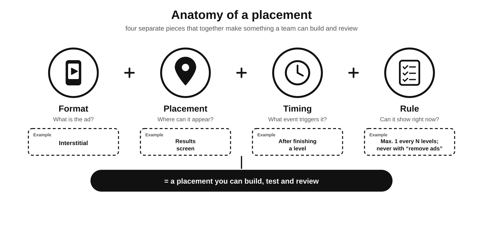
This distinction has an immediate practical consequence: most of the experience problems blamed on a format (“interstitials are annoying”) are really timing or rule problems. The format is rarely the culprit. What goes wrong is that nobody pinned down exactly when it can appear, or the rule that limits it doesn’t exist, or it only exists in the head of whoever wrote the code. In other words: three of the four pieces are about the user’s journey, not about the ad.
The user’s flow: where an ad makes sense and where it doesn’t
Before getting into each format we need a map, and that map isn’t the list of screens in the app—it’s the path the user takes through them. It’s the question that most shapes how any ad is perceived, whatever its format: where in the flow is the user when it appears?
In the previous article we linked tolerance for advertising to the type of app and to what the user is doing in general. Now we’re going to zoom right in, down to the specific instant: not what kind of app it is, but what’s happening in the user’s journey at the exact moment the ad fires. A single app goes through dozens of different states in one session, and each one comes with a very different tolerance.
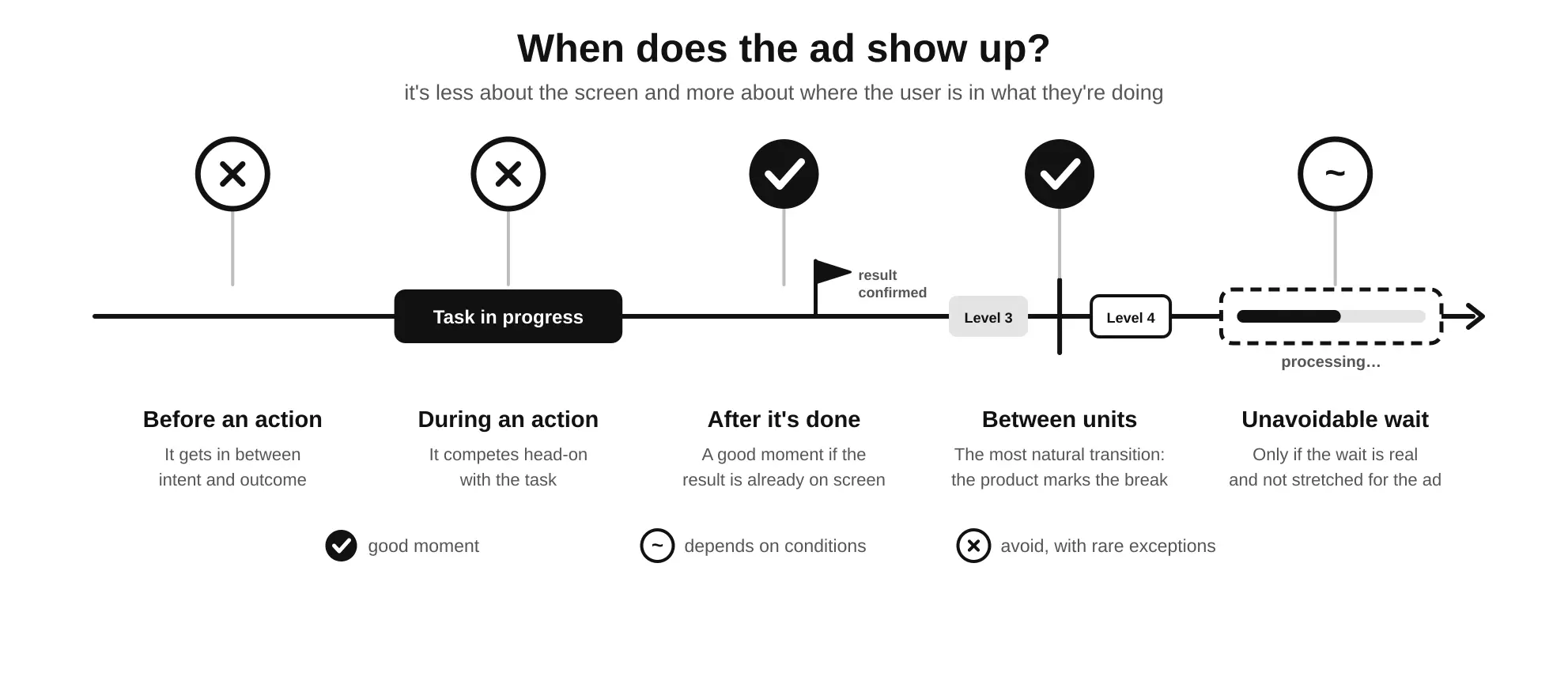
Before an action. The user has just opened a screen or is about to start something: tapping “play”, opening a document, starting a search. It’s usually a bad moment, because the ad gets in between the intention and its outcome. The user has a clear goal and the ad delays it, which turns advertising into an outright obstacle. The natural exception is the rewarded ad the user asks for themselves before starting, because in that case the ad is part of what they meant to do.
During an action. While the user is in the middle of a task—playing a match, typing, watching a video they chose, filling in a form—the ad competes head-on with what they’re doing. It should be avoided except in very specific cases where the format is designed for it, such as a banner that sits alongside without interrupting, or ad breaks in long-form video, where there’s a convention users already know and accept.
Even that convention has its limits, and live streams are the best example of where it breaks down. In a film or a recorded video, the ad pauses the content, and when it ends, the user picks up exactly where they left off. In a live stream there’s no pausing: the event keeps happening while the ad takes over the screen. Plenty of live video platforms drop ad breaks at any point in the broadcast, with no regard for what’s going on, and anyone who has watched a match, a gaming stream or a live event knows how that ends: you come back from the ad and you’ve missed the goal, the decisive play, or the moment everyone’s talking about in the chat. The user hasn’t just been interrupted—they’ve lost something they can’t get back, the very thing they were there for. It’s the purest form of the “during an action” ad, and it explains why the more careful platforms tie those breaks to real pauses in the broadcast, let streamers decide when to run them, or soften the blow, for instance by showing the ad in a smaller window while the stream stays visible.
After an action is completed. If the result is already confirmed and visible, and the user isn’t waiting for an immediate response from the app, it can be a good moment. The key is that “already confirmed”: the user has mentally closed the task and knows it went well. An interstitial that appears after the user has seen their final score is a very different thing from one that appears before the score is shown.
Between clearly separate units. Levels, articles, episodes, matches or independent tasks offer natural transitions, because the structure itself already marks an end and a beginning. The user understands the pause because the shape of the content makes it obvious. It is, by a wide margin, the most natural moment for formats that interrupt.
During an unavoidable wait. When the app has to do something that takes time—processing a video, generating a report, syncing data—an ad can fill that wait without adding friction, as long as two conditions are met: the wait has to be real and not stretched out to make room for the ad, and the app has to keep working normally if the process finishes before the ad does, or if the user would rather do something else in the meantime.
The interesting thing about thinking in states rather than screens is that it forces you to see the experience the way the user does. To the code, “going back to the home screen” is always the same event. To the user, it might be the end of a task, the return from a quick lookup, or a way out of an error. Only the first one is a good moment for an ad.
With this map in hand, each format makes more sense through its relationship with the flow than through its looks. The banner lives alongside the journey without stopping it. The interstitial fills a transition. The rewarded ad opens a detour the user chooses to take. The native ad travels inside the content. And the app open ad sits at the threshold of the session, right before the journey begins. Each of those relationships comes with its own demands, and those are what we’ll look at next.
Banner: living alongside the flow without disrupting it
The banner is the only format that doesn’t pick a moment in the journey: it’s there the whole way through. That’s its strength, because it never stops the user, and also its challenge, because the only way it works is if the flow stays exactly as it would be without it. It’s the easiest format to integrate and, precisely for that reason, the one that gets the least care. Its problems don’t land as a single blow but as constant friction: an interface that shifts, a button that’s awkward to hit, a patch of the screen that flickers every so often. None of those details makes anyone uninstall the app on the spot, but they all add up.
Reserve the space before the ad arrives
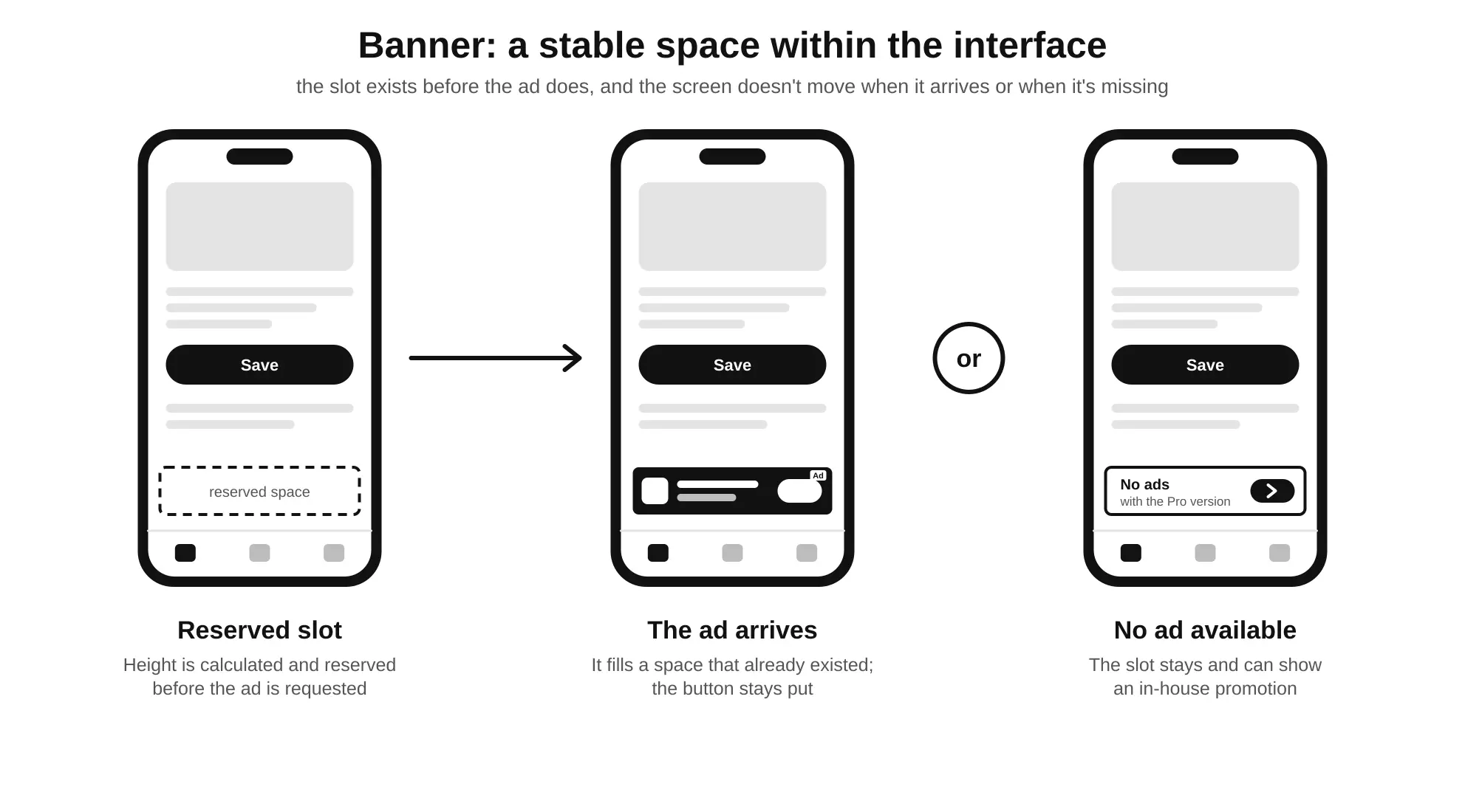
When a screen is drawn, the ad doesn’t exist yet. The app requests it, the market takes a few hundred milliseconds to respond, and the creative has to be downloaded and rendered. If the interface hasn’t reserved the space the ad will take up, then the moment the banner arrives, everything around it shifts to make room. This is what’s known as a layout shift, and it’s especially harmful because it happens just as the user has started interacting with the screen: they were reading the first line, or their finger was already on its way to a button.
Anyone who reads the news on their phone knows the most infuriating version of this problem. You open an article, start reading and, without touching anything, the text suddenly jumps: the paragraph you were on disappears down the page, or up it, and you have to scan around to find your place. A few seconds later it happens again, because another ad block further down has finished loading, or an ad that was already there has refreshed with one of a different height. None of those ads asked the reader for anything, but between them they took away the only thing the reader came to do: read without interruption. It’s the perfect example of why it’s not the advertising but the experience—the reader doesn’t remember what those blocks were advertising; they remember not being able to do what they came for, which was simply to read a story, an article, or any piece of text.
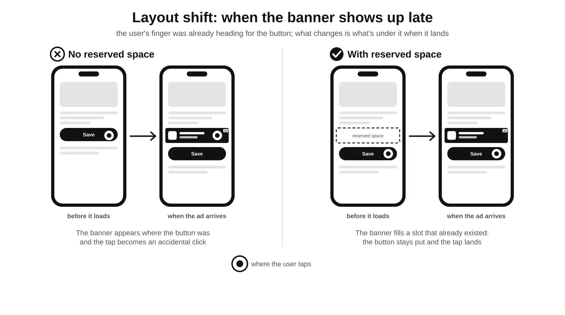
The fix is to reserve the height as soon as the screen is built, before the ad is even requested. With fixed-size banners this is trivial, because the height is known in advance. With adaptive banners, which adjust their size to the available width to make better use of the screen, the height depends on the device, but the usual SDKs let you calculate it from the width before making the request. That calculation is what should be used to size the container, so that when the ad arrives it simply fills a space that was already there.
On the web, this problem even has its own name among performance metrics: CLS (Cumulative Layout Shift), one of the Core Web Vitals Google uses to assess a page’s experience. An ad slot with no minimum height reserved is one of the most common causes of poor CLS, so the cost isn’t just to the experience but to search ranking too.
Keep it away from interactive controls
A banner pressed up against the bottom navigation bar, a floating action button or the on-screen keyboard is an open invitation to accidental clicks. The user meant to switch tabs and ends up in an app store. That click shows up in the stats, but it’s worthless: the user is back in two seconds, annoyed, and the advertiser has paid for a visit with zero intent behind it. Ad platforms know this, which is why their policies explicitly prohibit placing ads in ways that encourage accidental clicks; a sustained pattern of them can lead to limited ad serving or a suspended account.
Separating the banner from the controls with a clear margin, or with a visual element that marks the boundary, is a small design decision with a big impact. It’s also worth checking what happens when the keyboard comes up: on many screens with forms, the bottom banner ends up sitting right on top of the keys, or covering the submit button.
Fixed, adaptive or collapsible
Not all banners behave the same way, and the choice affects the experience as much as the location does. A fixed-size banner is predictable but wastes space on wide screens, where it ends up as a narrow centered strip with empty margins on both sides. An anchored adaptive banner spans the full width and usually performs better, in exchange for a variable height that needs to be calculated. There’s also an inline variant, designed to sit within scrolling content, where it can be taller because the user scrolls past it rather than having it in front of them all the time.
The trickiest case is the collapsible banner: a banner that first appears at a larger size, overlapping part of the content, and that the user can collapse down to its normal size. It can work well if it’s shown at specific moments, such as when entering a new screen, but it becomes a nuisance if it expands again with every refresh. If you use it, the display rule needs to make clear when the expanded version is allowed and when only the regular one should be requested.
| Banner type | Main advantage | What it demands from the implementation |
|---|---|---|
| Fixed | Known height, predictable behavior | Accepting wasted space on wide screens |
| Anchored adaptive | Uses the full width | Calculating the height before the request and reserving it |
| Inline | Blends into scrolling content | Making sure it doesn’t break the reading rhythm |
| Collapsible | More visibility at specific moments | Limiting when it can appear expanded |
What to do when there’s no ad
As we saw in the first article, not every request finds an ad. For the banner, this raises a design question almost nobody asks until they see it in production: what goes in that reserved slot when nothing comes back?
There are three reasonable answers. The first is to leave the space empty or with a neutral background, which keeps the layout stable but leaves a dead strip. The second is to collapse the container, which reclaims the space but brings the layout shift back if the ad shows up later. The third, and often the most interesting, is to fill that space with your own content: an in-house promotion for the ad-free version, for another app by the same developer, or for a feature the user hasn’t discovered yet. These house ads don’t generate direct ad revenue, but they turn an empty slot into a chance to convert users toward other revenue streams—especially useful for products with a hybrid model.
Refresh sparingly, and only when it’s visible
A banner that stays on screen for a long time can be refreshed to show a different ad, generating new impressions without the user changing screens. Platforms usually let you configure that interval; AdMob, for example, supports refresh rates between 30 and 120 seconds and recommends 60. Dropping to the minimum might look like an easy way to multiply impressions, but every refresh is a visual change on the edge of the user’s attention, and a banner that’s constantly changing stops being discreet.
There’s a technical detail that matters more than the interval: don’t refresh or request ads when the banner isn’t actually on screen. If the app goes to the background, if the user opens a modal dialog that covers it, or if the banner lives in a tab that isn’t the active one, continuing to request ads just generates requests that will never be seen, drags down your inventory’s viewability metrics, and burns through data and battery.
Being on screen isn’t the same as being seen
This leads to a distinction worth keeping in mind with any format, but especially with banners: an ad being rendered in the interface doesn’t mean anyone is seeing it. The industry uses a reference standard, defined by the Media Rating Council , under which a display ad counts as viewable when at least 50% of its pixels stay on screen for one continuous second (two seconds for video). An inline banner that loads at the end of a list the user never reaches, or one stuck behind a semi-transparent toolbar, may count as an impression in some systems while never reaching that threshold.
Advertisers increasingly value real viewability, and low-viewability inventory ends up being paid less. But beyond the money, checking whether the banner is actually being seen is a good way to spot design problems: an ad that’s never seen is probably sitting somewhere it does nobody any good.
Small screens, big screens, and everything in between
A banner that looks well balanced on the development team’s phone can take up a disproportionate share of the screen on a compact phone in landscape, or get lost on a tablet. You also have to account for the safe areas on modern devices—notches, gesture bars, rounded corners—which can clip part of the ad or leave it jammed up against a system gesture. Testing the placement on at least one small device, one large one, and in both orientations should be part of the process, not something you find out about from the reviews.
Interstitial: fill a transition, don’t manufacture one
The interstitial is, by definition, an interruption: it takes over the whole screen and temporarily stops the journey. That doesn’t make it a bad format. It makes it a format that only works in one very specific part of the journey—the transitions we identified when we looked at the user’s flow—and one that demands precision, because any timing mistake is felt immediately and very directly.
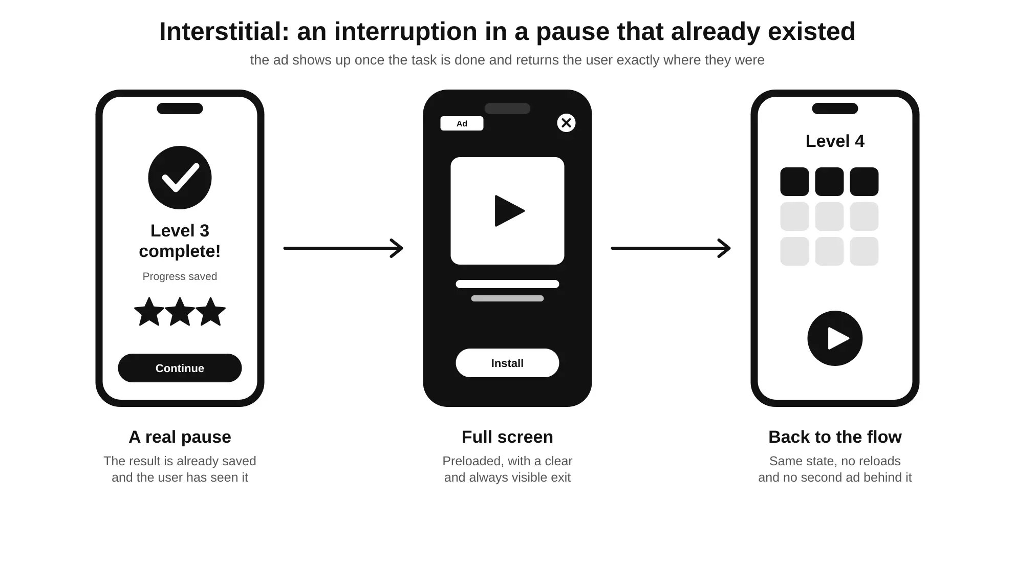
The whole implementation of an interstitial revolves around one question worth asking before writing a single line of code:
Has the app already reached a natural pause, or are we manufacturing one just so we can show the ad?
If the pause is real—the level is over, the article has been read, the export has finished and the result is on screen—the interstitial takes advantage of a gap that was already there. If the pause doesn’t exist and is created artificially—a loading screen that isn’t loading anything, a delay before showing a result that was already ready—the user notices, even if they can’t quite explain what just happened.
Load early, show later
An interstitial shouldn’t be requested at the moment you want to show it. By then it’s too late: loading can take a second or two, or fail, and in the meantime the app sits in an awkward limbo. The right pattern is to preload it ahead of time—when the match starts, when the article opens, when the task begins—so that when the pause arrives, the ad is already available and the app only needs to show it.
That preloading comes with a catch: loaded ads don’t last forever. In AdMob, for example, a loaded interstitial expires after one hour. If the app preloads one at launch and the user spends two hours on a long task, the ad it tries to show at the end won’t be valid anymore. The preloading logic has to account for that expiry and request a fresh ad when needed, rather than assuming whatever was loaded once is still good to go.
Never during a critical action
The interstitial must not appear while the user is doing something that matters: filling in a form, in the middle of a match, confirming a payment, writing a message. That sounds obvious when you put it like that, but in code it isn’t always. An interstitial fired by a timer (“every X minutes”) has no idea what the user is doing at that moment, and sooner or later it’ll show up at the worst possible time. That’s why it’s better to always tie it to app events that mark the end of something, never to the passage of time alone.
A particularly treacherous case is the ad that shows up before confirming that an operation has finished. The user taps “save”, the app sends the request to the server and, without waiting for the response, shows the interstitial. If the operation fails while the ad is on screen, the user closes it and runs into an error they don’t understand—or worse, no message at all, believing everything has been saved. The right order is always the reverse: first the result is confirmed and shown to the user, and only then, if appropriate, does the ad appear.
Clear exit points, not screens without context
The best moment for an interstitial is when the user has just mentally closed one unit of use and is about to choose the next. The worst is when they don’t even know what they’ve just done. A typical example of the latter is showing the ad when returning from a secondary screen—settings, profile, help—to the home screen. From the code’s point of view it’s a transition like any other; from the user’s point of view, nothing has ended. They just looked at something and came back.
The same goes for interstitials tied to navigation (“every time this screen opens”). They turn a routine action into a lottery: the user doesn’t know whether tapping a button will take them where they want to go or to an ad, and starts hesitating before navigating. The platforms’ own policies explicitly discourage interstitials that appear after every user action or unexpectedly.
Never right after another ad
An interstitial immediately after a rewarded ad the user has just chosen to watch, or right behind an app open ad, is one of those combinations nobody designs on purpose but that show up when each format runs on its own independent logic. The user has just given up their attention, closes the ad, and finds another one waiting. The display rule for each placement should know, at the very least, when the last ad of any format was shown—not just its own.
When loading fails
If the ad isn’t available at the expected moment, the app should carry on as if the placement didn’t exist. It shouldn’t wait, it shouldn’t show a loading indicator, and it shouldn’t retry in a loop. The user doesn’t know there was supposed to be an ad there and has no reason to notice it’s missing. This rule seems obvious, but the opposite mistake is common: a transition screen that waits for the ad’s callback before moving on, and gets stuck if that callback never arrives.
Respect the app lifecycle
An interstitial should only be shown with the app in the foreground and the relevant screen active. If the user sends the app to the background right as the ad was about to show, the right move is to drop that opportunity, not save it to show the moment they return. Coming back to an app and being greeted by a full-screen ad with no context whatsoever is one of the most disorienting experiences a product can deliver. Coming back from the ad needs care too: when the user closes it, the app should be exactly where they left it, with its state intact, without reloading the screen or losing what was on it.
Rewarded ads: a detour the user chooses
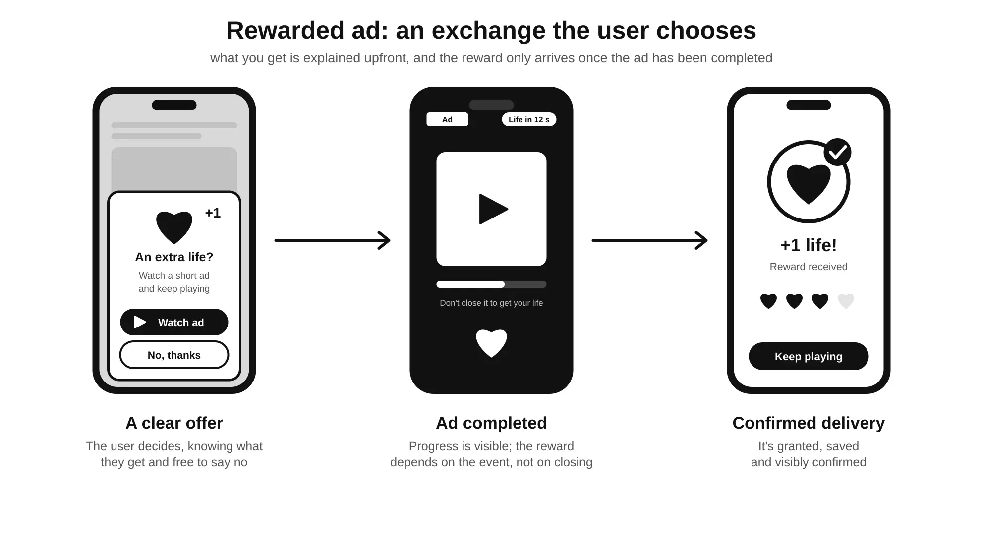
In the previous article we introduced the rewarded ad as the format that flips the usual logic: the user isn’t subjected to an interruption, they accept an exchange. Seen from the flow’s perspective, the rewarded ad doesn’t cut the journey short; it opens an optional detour—a branch the user can take or ignore, and that should bring them back to the main path with something they didn’t have before. That promise only holds if the implementation honors it at every step. A badly implemented rewarded ad—with an unclear reward, one that triggers by accident, or one that doesn’t deliver what it promised—breaks exactly what made it valuable: the trust that the deal is fair.
The flow of a well-designed rewarded ad is a sequence where each step depends on the previous one, which is why it’s worth walking through in order:
- The user asks for the reward by tapping an option that offers it explicitly.
- The app confirms exactly what they’ll get in exchange for watching the ad.
- The ad is shown, and it should already be loaded.
- The user watches it to the end.
- The app verifies that the ad was genuinely completed.
- The reward is granted, with visible confirmation that it has arrived.
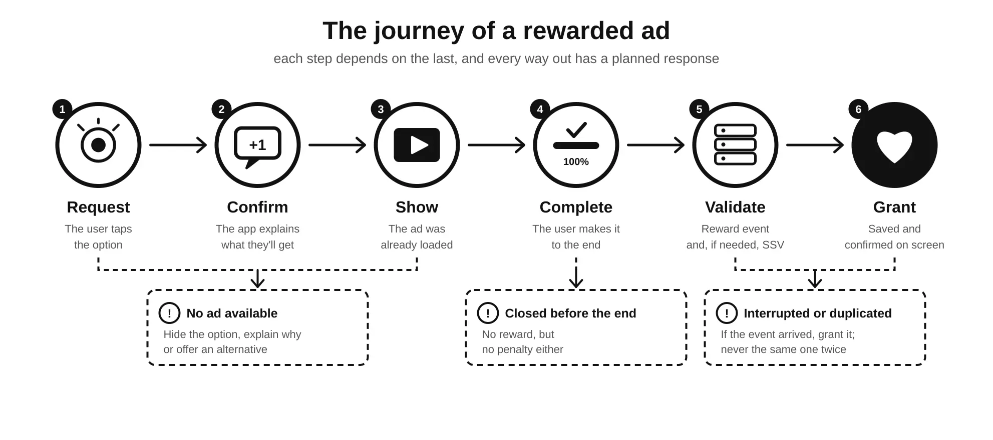
The fifth step includes an acronym worth clearing up right away: SSV (server-side verification). It’s a mechanism through which the ad platform itself notifies the app’s server that a specific user has completed the ad, so the reward doesn’t depend solely on what the device says. It isn’t always necessary—hence the “if needed” in the diagram—and we’ll look at when it’s worth using a little further on, when we get to delivering the reward.
Explain the reward upfront, not afterwards
The button offering the rewarded ad has to say what you get: “Watch an ad to get an extra life”, “Unlock this chapter by watching a video”. A generic button with a video icon and the word “Free” forces the user to guess the deal, and people who don’t understand a deal tend not to take it—or to feel cheated if they do and the result isn’t what they expected.
For the rewarded interstitial, the variant that appears at a transition without the user having asked for it, this upfront explanation isn’t just good practice: platforms like AdMob require an intro screen that explains the reward and lets the user opt out before the ad starts. That screen is what separates an exchange that’s being offered from an interruption with a consolation prize.
User-initiated and hard to trigger by accident
A standard rewarded ad must always start with a deliberate action. That rules out any design where the ad kicks off from tapping a large area of the screen, pressing a button that normally does something else, or as a side effect of closing a dialog. If the “watch ad” button sits in the exact spot where the “continue” button was a moment earlier, sooner or later someone will hit it by mistake, and the exchange stops being voluntary.
Grant the reward only when it’s earned
Ad SDKs notify the app, through a specific event, at the moment the user has earned the reward. That event—not the ad closing, nor the ad starting—is what should trigger the reward. Mixing them up leads to two opposite mistakes: granting the reward to someone who closed the ad after three seconds, or withholding it from someone who watched the whole thing but closed it in a way the app didn’t expect.
When the reward has real value within an economy—virtual currency, paid content, competitive advantages—it’s worth going a step further and validating it on the server. Server-side verification (SSV) lets the ad platform notify the app’s backend directly that a specific user has completed an ad, so the reward doesn’t depend solely on what the client says, which can be tampered with. That validation has to be idempotent: if the same notification arrives twice, the reward is granted only once.
Interruptions, early exits and network failures
What happens if the user gets a phone call in the middle of the ad? What if they lose connection with two seconds to go? What if the app closes right after earning the reward but before saving it? These are edge cases, but in an app with thousands of daily users they happen every single day. The general rule is to give the user the benefit of the doubt: if the reward event arrived, the reward must stick even if the app closes immediately afterwards. A user who watched the whole ad and got nothing won’t tap that button again.
You also need to think about what happens when no ad is available at the moment the user asks for one. Showing the button and then responding with an error when it’s tapped is frustrating. It’s better to check availability before offering the option, and if there’s no ad, hide it, disable it with an explanation, or swap it for an alternative: wait a while, spend accumulated currency or, in a hybrid model, simply buy whatever the ad would have unlocked.
Rewards that are worth it—and that stay optional
A vague reward (“a bonus”) or one that’s tiny compared to how long the ad takes teaches the user that the deal isn’t worth it, and from then on they stop accepting it. But the opposite mistake is worse: designing the product so that the reward stops being an extra and becomes a requirement. If progressing in a game is practically impossible without watching ads, or a basic feature of a tool only unlocks for ten minutes in exchange for a video, the voluntary option has turned into a hidden toll. Technically it’s still a rewarded ad, but the user experiences it as a mandatory interstitial—with more resentment, because they can also see the trick.
Native ads: inside the content, without disguising themselves as it
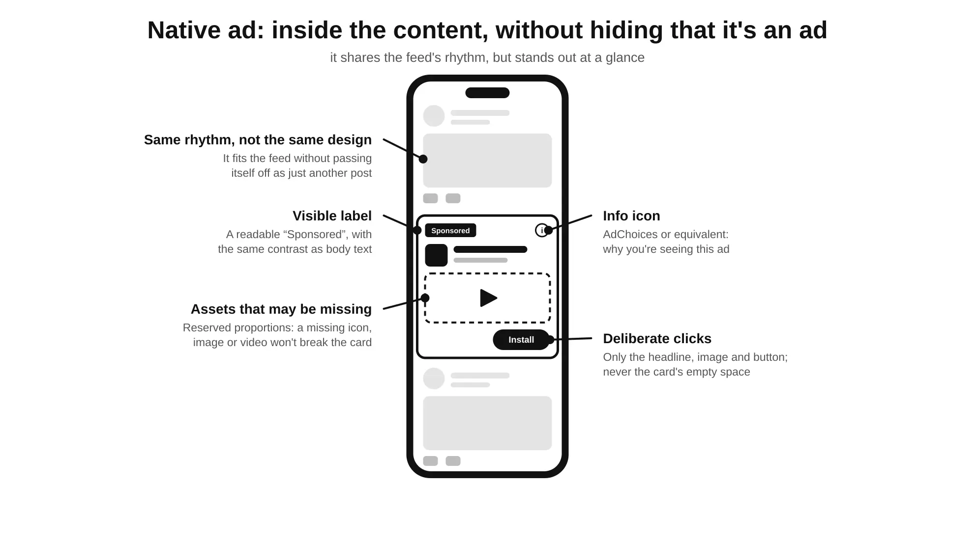
If the banner lives alongside the flow from the outside, the native ad travels inside it: it appears in the same scroll-and-read journey as the content, at the same rhythm and with a similar look. That’s why it’s the format that demands the most design work, because unlike the others, the app doesn’t receive a ready-made ad. It receives the pieces—headline, body text, image, icon, advertiser name, call to action—and it’s up to the app itself to decide how to put them together so they fit the interface’s style. That freedom is both its biggest advantage and its biggest risk.
The idea that should guide the entire implementation fits in one sentence:
Integrating an ad into the content doesn’t mean hiding that it’s an ad.
Always clearly labeled
Every native ad must carry a clear marker identifying it as advertising—“Ad”, “Sponsored”—and, on many platforms, the AdChoices icon or equivalent that lets users find out why they’re seeing that ad. These aren’t decorative elements: they’re requirements in ad networks’ policies, and leaving them out can get the account’s monetization blocked. But above all, they’re the line that separates integration from confusion.
That marker has to be genuinely readable. A tiny label, light gray on a white background, tucked into a corner where the eye never lands, meets the letter of the rule but betrays its intent. The same contrast standard applied to the rest of the interface’s text should apply to the ad label too. The Web Content Accessibility Guidelines (WCAG) put a number on it: a minimum ratio of 4.5:1 for normal text.
Put simply, that ratio compares how bright the background is with how bright the text is. The scale runs from 1:1, when text and background are the same color and nothing can be read, up to 21:1, which is pure black on pure white. A ratio of 4.5:1 means the lighter color is roughly four and a half times brighter than the darker one—enough to be read effortlessly even with poor eyesight or with the sun shining on the screen. For reference, a medium gray (#767676) on a white background sits right around 4.5:1, while the light gray so often used for “Sponsored” labels usually falls well short.
Respect the content hierarchy
A native ad in a feed should resemble the feed in rhythm and size, but it shouldn’t be indistinguishable from a post. Using the same typography and margins helps it not to break the reading flow; copying exactly the same card design, with the same kind of header and the same interaction buttons, crosses the line. A good starting point is to ask what a user would think if they saw the card for half a second while scrolling: if their first impression is “this is just another post”, the design is wrong.
Position matters too. A native ad in the first slot of a feed competes directly with the content the user came to see; one inserted at regular intervals, after the user has already gotten some value, feels like part of the journey.
Deliberate clicks, not accidental ones
In a native ad, only the ad’s own elements—the headline, the image, the call-to-action button—should be clickable. Making the whole card clickable, including the empty space around the elements, does increase clicks, but nearly all the extra ones are accidental, and platform policies explicitly prohibit it. The same goes for gestures: if the feed lets users swipe cards to dismiss or save them, that gesture shouldn’t trigger a click on the ad by mistake.
Make room for what might be missing
A native ad’s pieces don’t always arrive complete. Some are required (the headline, in AdMob’s case) and others are optional: it might come without an icon, without body text, without a rating, or with a video instead of an image. The template has to handle all of these cases without breaking. That means deciding what happens to the space for each missing element—hide it, collapse it, replace it—and checking that the card still holds together in every possible combination. It’s also worth reserving the proportions of the media area from the start, respecting the minimum sizes each platform requires, so that the image or video arriving doesn’t reproduce the same layout shift we saw with the banner.
Accessibility and readability
The ad’s elements must be accessible to screen readers just like the rest of the interface, ad label included, so that a user who can’t see the screen also knows they’re looking at an ad. And the ad copy, which the app doesn’t control, may be longer than expected: the template has to truncate it gracefully instead of overflowing or pushing the rest of the content around.
App open ads: at the threshold of the session, without turning it into a roadblock
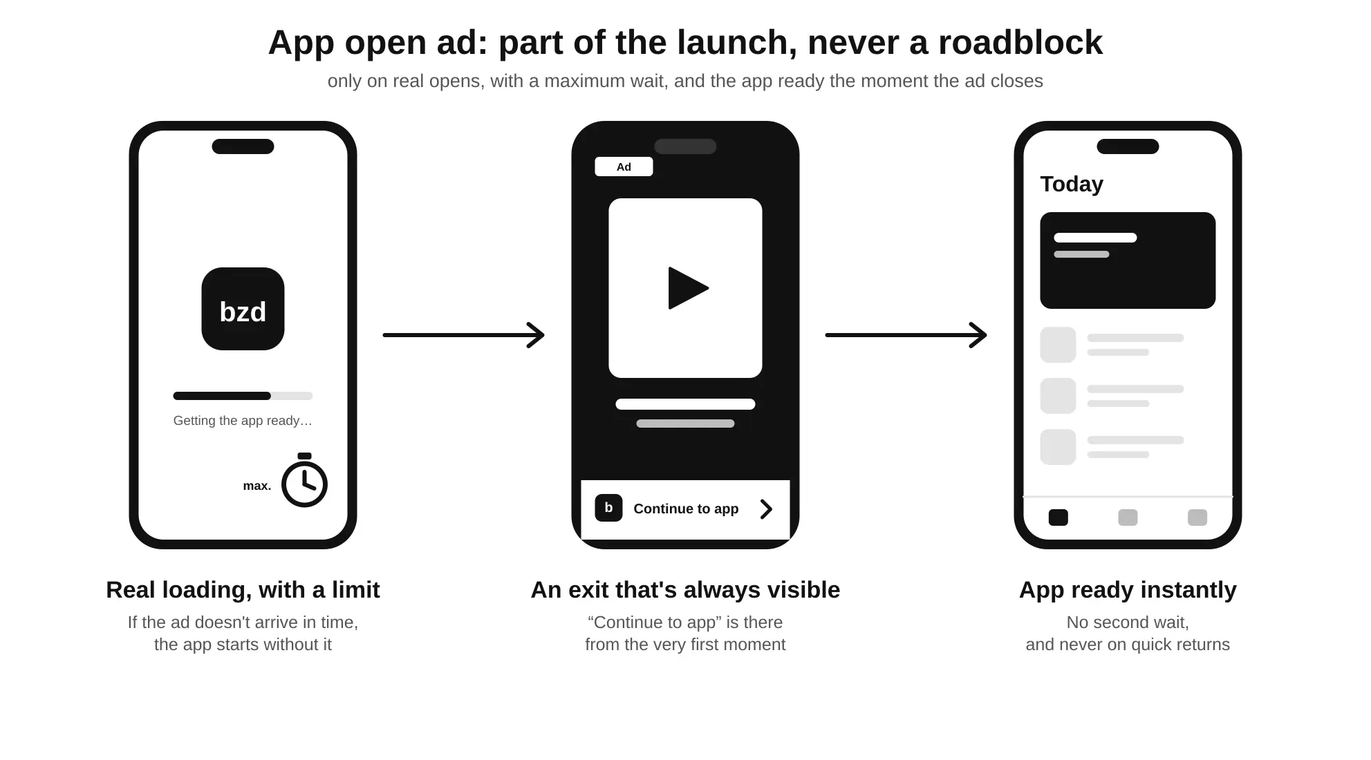
The app open ad appears at the one point in the flow that comes before all the others: when the user opens the app or comes back to it. It’s a valuable moment for monetization because it happens many times a day and the user hasn’t started any task yet. And it’s a delicate moment for exactly the same reason: the user opens the app to do something, and anything that gets in the way during that first second feels like an obstacle.
Show it when the app is genuinely ready
On a cold start—when the app launches from scratch—the app open ad should appear over a real loading screen, while the app gets ready, and not before there’s anything to show afterwards. When the user closes the ad, the app has to be usable at that very instant. If another loading screen appears after closing the ad, the user has paid the same toll twice.
A maximum wait time
On a cold start, the ad may not have loaded by the time the app is ready. The temptation is to wait a little longer, because the ad is “about to arrive”. The problem is that this wait blocks the user from getting into the app for something they never asked for. The implementation needs a maximum wait—a few seconds at most, ideally less than the normal loading would take anyway—and if the ad hasn’t arrived by then, the app starts without it. An ad that arrives late can be kept for the next valid opportunity, as long as it hasn’t expired (in AdMob, loaded app open ads expire after four hours).
Tell a real open from a quick return
The most common case isn’t a cold start but a return to an app that was in the background. And here you need to draw the line carefully. A user who comes back to the app after several hours is, in practice, starting a new session. A user who stepped out for thirty seconds to copy a verification code from their email, reply to a message, or simply locked the screen hasn’t opened anything: they’re carrying on with what they were doing.
Showing an app open ad in that second situation is one of the most irritating mistakes out there, because it punishes exactly the multitasking behavior operating systems encourage. The implementation needs a background-time threshold below which a return doesn’t count as an open, and it also has to exclude returns the app itself caused: coming back from a payment flow, a system permissions screen, a sign-in with a third-party provider, sharing content or, of course, another ad that opened the browser.
Always a way through
If something fails—the ad doesn’t load, the SDK doesn’t respond, the connection drops—the app must start anyway. The app open ad can never be a dependency of the launch. Nor does it make sense to show it on a new user’s very first open, when they don’t know the product yet and their first impression would be, quite literally, an ad.
When the flow goes sideways: the states every implementation must handle
So far we’ve talked about the ideal journey: the user finishes something, the ad appears in its place, and the flow carries on. But real-world experience is full of detours nobody designs: the connection drops, the user leaves the app, the ad doesn’t arrive or arrives late. In each of those cases, what the user perceives doesn’t depend on the ad but on how the app reacts.
That’s why a placement isn’t a call to show(). It’s a small state machine that has to respond correctly to everything that can happen between the app deciding to request an ad and the user getting back to what they were doing. Most implementations handle the happy path—the ad loads, shows, closes—and leave everything else to chance. And “everything else” is, in production, a very significant share of cases. The criterion for handling each one is always the same: the user’s flow has to survive intact, ad or no ad.
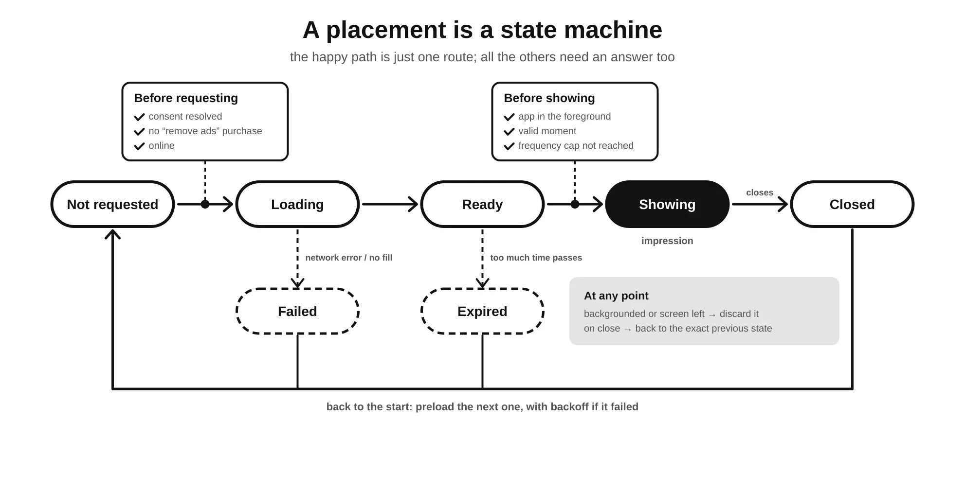
The following table lists the most common states and situations, along with what the app should do in each:
| Situation | What the app should do |
|---|---|
| Ad loading | Keep working normally; never block the interface waiting for the result |
| Ad ready | Keep it ready until a valid moment comes, keeping an eye on expiry |
| No ad available | Carry on without it; hide options that depend on it or offer an alternative |
| User leaves before it’s shown | Drop the opportunity; don’t show it on the next screen “to make use of it” |
| User closes the ad | Return them to exactly where they were, with no reloads or lost data |
| Network error while loading | Retry with exponential backoff, never in a tight loop |
| App sent to the background | Cancel the pending show and pause refreshes and requests |
| Orientation or size change | Recalculate the size of banners and native ads; don’t show full-screen formats mid-rotation |
| Lost connection | Don’t request ads; don’t offer rewarded ads that can’t be completed |
| User without consent | Don’t request ads until consent is resolved, or do so with the applicable restrictions |
| Frequency cap reached | Don’t show, even if an ad is loaded and the moment is right |
| User has paid to remove ads | Don’t initialize or request anything in the affected placements |
Two of these rows deserve a closer look. The first is consent. In regions like the European Union, the app can’t request personalized ads without the user’s consent, and on iOS, targeting based on the device identifier also depends on the system’s tracking permission. Consent management SDKs offer an explicit check for whether ads can be requested yet, and that check has to happen before the first request, not after. We’ll dedicate a whole article in this series to privacy and consent, but from the placement’s point of view one thing is enough: consent status is an entry condition of the display rule, just like the frequency cap.
The second is the user who has paid to remove ads. It sounds trivial, but it’s a very common mistake for paying users to still see, for a split second, the banner’s reserved slot, or for the SDK to keep making background requests that are never shown. For someone who paid for an ad-free experience, seeing even the empty container is a small betrayal. The purchase check should happen before the interface is built, not after.
A useful way to bring all of this into code is to centralize the decision in a single place instead of spreading it across every screen. Something along these lines, in pseudocode:
    fun canShow(placement: Placement): Boolean {
        if (user.hasRemovedAds) return false
        if (!consent.canRequestAds) return false
        if (!app.isInForeground || !placement.screen.isActive) return false
        if (session.isFirstSession && placement.excludedOnFirstSession) return false
        if (adHistory.secondsSinceLastFullscreenAd() < placement.minGapSeconds) return false
        if (placement.frequencyCapReached()) return false
        return placement.ad?.isLoaded == true && !placement.ad.isExpired
    }
The value of this approach isn’t the code itself, which every team will write its own way, but the fact that it forces every condition out into the open. When a rule lives inside a stray if on the results screen, nobody remembers it six months later. When it lives in a shared place, it can be read, reviewed and changed without fear of breaking something else.
Placement mistakes that look minor
The monetization mistakes that do the most damage are rarely big, wrong decisions. They’re usually implementation details nobody reviews because, taken one at a time, they seem insignificant—and nearly all of them have something in common: they break the flow at a point where the user didn’t see it coming. The following table lists the most common ones, along with what they really cause and a sensible alternative:
| Mistake | Why it seems harmless | What it actually causes | Alternative |
|---|---|---|---|
| Banner next to the main button | “It gets more attention there” | Accidental clicks, frustration and risk of penalties | Clear separation between ad and controls |
| Ad break in the middle of a live stream | “Ad breaks are normal in video” | The user misses a moment they can’t get back | Tie breaks to real pauses in the broadcast or keep the stream visible |
| Interstitial every time a screen opens | “It’s a transition” | Navigation becomes unpredictable | Tie it to the end of tasks, not to navigation |
| Ad before an operation is confirmed | “The operation is quick” | Errors the user doesn’t see or understand | Confirm the result first, ad afterwards |
| Banner that pushes content around | “It only happens once on load” | Taps in the wrong place, interrupted reading, worse CLS on the web | Reserve the height before requesting |
| Rewarded ad without explaining the reward | “The icon says it all” | Low opt-in and a sense of being tricked | Explicit copy: what you get and what it costs |
| Same ad repeated in a short session | “The SDK decides which ad shows” | Fatigue and a cluttered-feeling app | Frequency caps and spacing between formats |
| Native ad indistinguishable from content | “It blends in better” | Loss of trust in the entire feed | Visible label and a distinct design |
| Blocking the app while waiting for an ad | “It’ll only be a second” | Slow or stuck launches and transitions | Maximum wait and carry on without the ad |
| No plan for when there’s no fill | “There are always ads” | Empty gaps, broken buttons, frozen screens | Defined fallback behavior for every placement |
There’s a common pattern behind almost all of these mistakes: they were designed from the ad’s point of view, not from the point of view of the person using the app. Each of them improves, at least on paper, some number on the ad dashboard. And nearly all of them make something worse that never shows up on that dashboard.
Testing a placement before anyone sees it
Before you get to real user data, there’s a validation phase you can run without a single outside user, and it heads off most of the problems we’ve described. It doesn’t replace measurement, but it catches the most obvious mistakes before they reach production.
First, always work with test ads during development. Every platform offers test ad units or a way to register test devices, and using them isn’t optional: clicking on real ads in your own app, even just to check they work, can be flagged as fraudulent activity and put the account at risk. The inspection tools some SDKs include—such as AdMob’s Ad Inspector—also let you see in real time which requests are being made, which demand source responds, and why an ad fails when it does.
Second, deliberately trigger the tricky states instead of waiting for them to happen. Switch on airplane mode right before a placement. Send the app to the background while an interstitial is loading. Rotate the device with a rewarded ad open. Close the ad in the first second. Simulate no fill by returning a forced error from the code in a test build. Each of those experiments takes a minute and answers a question that users would otherwise answer for you in the reviews.
And third, perhaps the most revealing of all, use the app for a while the way someone who didn’t build it would: a full session, no shortcuts, paying attention to how many ads appear, when, and how each one feels. It’s surprising how many unfortunate combinations—two ads back to back, an app open ad when returning from a payment, a banner covering a button with the keyboard open—only come to light this way.
All of this tells you whether a placement works, but not whether it’s the best possible option. Does the interstitial perform better every three levels or every five? Does the native ad work better in the fourth slot of the feed or the eighth? Is it worth offering the rewarded ad after a loss, or only from the store? Answering those questions on instinct is tempting, and it usually goes badly. The reliable way to do it is with A/B tests: showing two variants of the same placement to comparable groups of users and comparing not just revenue but also retention, session length or purchases. They need their own methodology—sample size, duration, which metric decides, and what to do when revenue and retention point in opposite directions—so we’ll give them their own space in upcoming articles in the series.
It was never the advertising—it was the experience
Let’s go back to the ad that made you sigh at the start of this article. It’s easy now to put a name to what went wrong: a banner with no reserved space, an interstitial that manufactured a pause that didn’t exist, an app open ad that mistook a thirty-second return for a fresh open, a rewarded ad that didn’t deliver what it promised. In none of those cases was the problem that there was advertising. The problem was what the advertising did to the journey.
The quality of a placement isn’t decided by the format it uses, but by where it sits in the flow and by the rules around it. A banner needs stability to live alongside the journey. An interstitial needs a real transition to fill. A rewarded ad needs a clear exchange the user chooses. A native ad needs transparency to travel inside the content. An app open ad needs to keep the threshold of the session from becoming a roadblock. And all of them need to know what to do when things don’t go to plan, because in an app with real users, that happens all the time.
A good test for any placement is to ask whether the user could describe what they were doing before and after the ad as one continuous journey. If the answer is yes, the advertising has become part of the experience. If the answer is “I was doing something and then suddenly…”, it doesn’t matter how well it performs on the dashboard: the experience is broken, and the user will remember that more than any ad.
Implementing advertising carefully isn’t a concession made at the expense of revenue. It’s what keeps that revenue coming a month from now, when the user decides whether to open the app again.
But designing a placement well is only half the job. The other half is checking whether it works: what’s really happening between an ad being requested and an ad being shown, where in the funnel opportunities are being lost, how each placement affects user behavior, and why immediate revenue isn’t enough to judge a monetization decision. That’s what the next article in the series will cover, dedicated to measurement.
Happy earning!