A few weeks ago I shipped a new update for WorkIO . From the outside it looked like any other update: new screens, a widget, fewer bugs, some design polish. What almost nobody sees is that writing the code was, probably, the last important decision I made in the whole process.
Ask any developer how much of an update is spent writing code, and the honest answer is usually “pretty much all of it.” Makes sense: it’s the part that shows up in commits, in changed lines, in hours logged in the editor. It’s the only part that leaves a visible trail. But an update doesn’t start when you open the IDE. It starts long before that. And it doesn’t end when you hit publish, either.
It all started long before the code
It didn’t start with a to-do list. It started with small symptoms, the kind you keep brushing off individually until, added together, they stop being small.
Users reach out through all kinds of channels. Some send emails, others leave reviews, others vent on social media, and others simply stop using a feature, or the app altogether. Not all feedback carries the same weight: a request that twenty different users bring up independently probably deserves a lot more attention than a one-off comment, while at the same time a single, well-argued message can uncover a huge problem nobody had spotted yet. In the end, a user’s trust isn’t built inside the app alone , it’s shaped by everything around those listening channels too.
In WorkIO’s case, one of those signals kept coming up in support. When logging a work session, options like overtime, breaks or notes had been tucked away behind an extra dropdown for a while. They worked fine, but users had to know they were there, read the hint text or just guess to ever find them. Most of the confusion we got wasn’t about bugs, it was “wait, how do I add overtime?” The feature had been there all along; what was actually broken was the communication.
Listening isn’t about writing everything down. It’s about figuring out the real problem behind each message, because users often propose a solution when what actually matters is uncovering the problem they were trying to solve.
Practical tip: when a request comes in, don’t write down the solution the user is suggesting, write down the problem. Two users can ask for completely different things while, underneath, describing the exact same underlying issue.
Those comments raised a suspicion. But a suspicion, on its own, isn’t enough to justify an update.
When listening wasn’t enough anymore
What was missing was checking whether the data told the same story. Not all feedback comes in writing: part of listening means paying attention to what the app itself is quietly reporting, in the Google Play console, in diagnostic tools, in stability reports.
We spent a good chunk of the previous cycle digging into the most frequent ANRs (Application Not Responding, moments when the app stops responding) that the Play Store was flagging. No user had ever written in to complain about it specifically, but the data was sitting right there, waiting for someone to pay attention.
At the same time, we were using LeakCanary to track down several memory leaks the app had been carrying for a while. WorkIO has quite a few years behind it by now, and the way it was originally built reflects a very different set of Android practices and knowledge than what I have today. Nobody reports that kind of technical debt, because in most cases users don’t even perceive it as such; they just notice the app “feels a bit slower sometimes” or “closes on its own every now and then” without really knowing why. Tracking down and fixing those leaks was quiet, invisible work for the end user, but it had a direct impact on stability that people do end up noticing.
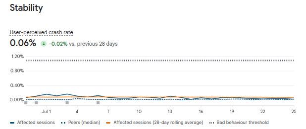
WorkIO already had a pretty low error rate, but this review helped us push it even lower: the user-perceived crash rate Google Play reports (the percentage of daily active users who experience at least one crash they likely noticed, for example while the app is showing a screen or running a foreground service) dropped from 0.07% to 0.06%. That might sound like a tiny, almost trivial difference, but once you’re already starting from such a low baseline, every tenth of a point you shave off represents a meaningful relative share of users who no longer run into that problem.
Practical tip: if your app has some history behind it, check the stability section (Android Vitals in Google Play Console, or its equivalent in App Store Connect) before deciding what goes into your next update. More often than not, the biggest problem isn’t the one people talk about the most, it’s the one they quietly put up with.
With support complaints on one side and stability data on the other, the picture was starting to come together. But having a clear picture of what’s broken isn’t the same as knowing what to do about it. That’s when it was time to start deciding.
Then it was time to decide
One of the hardest skills in product work is saying no. Not because an idea is bad, but because it might not be the right moment for it. Every new option adds complexity, every new button adds cognitive load, and every extra setting means another user needs more time to learn the app.
Sometimes the best update is the one that removes a feature nobody uses, or the one that manages to do the same thing with half the elements on screen. Not everything the data and the users were pointing to could fit into the same release, so we had to prioritize: stability first, then anything affecting how understandable the app was, and leave for later whatever was nice to have but not urgent. We’ve touched on how a feature’s importance shifts depending on where the product is at before, and this was just another example of that same idea.
Practical tip: before greenlighting anything new, ask yourself whether a regular user of the app would know how to use it on the first try, without reading any help text or asking anyone. If the answer is no, the problem usually isn’t that it needs a better explanation, it’s that it needs to be simplified first.
With priorities settled, what was left was figuring out how all of it should look and feel. That’s where design came in.
Only then did design come into play
Once we knew what we wanted to fix, the next question was how users would expect to find each improvement. Not how we could build it, but what would feel most natural to use. When an update is genuinely well designed, users barely have to think: they just understand how it works. That rarely happens by accident.
Overtime, breaks and notes, hidden away until then, moved into the main form with a more modern look, so they’d be visible from the very first moment instead of making users guess where to look.
We also took the chance to modernize the rest of the interface following the same logic: splitting content into clear sections with distinct cards instead of the flatter layout it had before, and adding icons and visual cues in places that used to be just a plain colored background, like the notice that an ad is loading before it’s shown.
That ad-loading notice deserves a mention of its own, because it’s a good example of how even the smallest detail is a UX decision, the same idea I wrote about when I talked about how in product, there’s no such thing as an innocent change . We explicitly warn users before an ad is about to appear, so it doesn’t catch them off guard and they don’t end up tapping it by accident. It’s not a technical requirement, it’s a deliberate communication choice: we’d rather be upfront about something we know can be annoying than optimize for accidental clicks.
We also revisited the quick clock-in flow, trimming the steps involved and tightening its usability so that any user, even someone who’d never opened the app before, could figure out how to clock in at a glance. And for subscribed users, we added a new widget that lets you log and track your workday, quick clock-in included, straight from the phone’s home screen, without ever opening the app.
None of these changes came from “let’s freshen up the app a bit.” Each one answered a specific friction point we’d been watching for a while: hidden features, extra steps, an interface that had visually fallen behind what users expect from any app today.
Now the code finally arrived
Only after all of that did we open the editor. Working through the already-prioritized ANRs one by one, closing the memory leaks LeakCanary had flagged, rebuilding the work-session form and much of the interface around the new block-based system, building the quick clock-in widget from scratch. Real technical work, no doubt, but every line answered a decision made well before: what to fix first, what to show and where, what was actually worth building from the ground up.
Ironically, this tends to be the most comfortable part for a lot of developers, because by then the problem is already defined.
The finish line was still far away
Plenty of people would assume the work is done once the build is generated. In reality, that’s where a whole different phase begins: writing release notes, submitting the update, waiting on store reviews and, in many cases, running a staged rollout, basically keeping an eye on how things evolve and how people react to the changes.
Shipping to 100% of users right out of the gate can turn a small bug into a massive problem. Rolling out an update gradually lets you catch issues before they reach your entire user base, leaning on the same testing phases Google Play and the App Store offer to widen coverage safely as you go.
Practical tip: if your platform supports it, always start with a small percentage (5-10%) and watch your crash metrics and reviews for at least 24-48 hours before ramping up coverage. That buffer is, more often than not, the difference between a minor incident and a full-blown reputation crisis.
But the most important part was still missing
Publishing isn’t the end, it’s the start of the next conversation with your users. You need to watch for unexpected errors, usage metrics, reviews, new comments, support tickets and how features actually get used in the wild. Sometimes a technically flawless feature ends up being used in a completely different way than intended, and that means starting the cycle over again: listen, analyze, decide, design, build, publish, and listen again.
This time, the answer came fast and it was clear: the eleven reviews we got after publishing were all 5 stars, every single one. It’s not a huge sample, but for an app used by tens of thousands of people a month, eleven straight top-rated reviews is a fairly reliable sign that the direction we took was the right one.
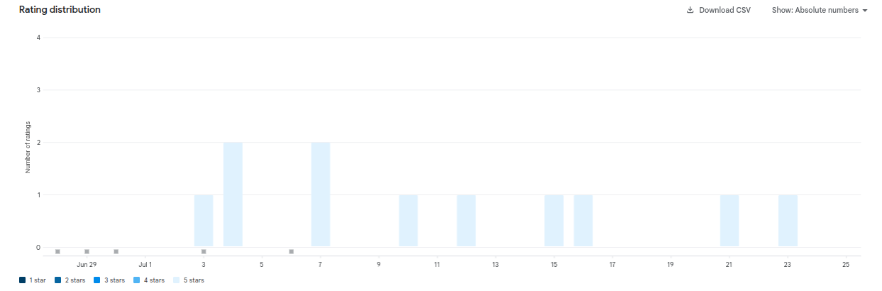
What’s interesting is that this positive response showed up despite adding two new ad banners in the very same update: one at the top of the work-session list screen and another between the cards in the stats section. In the same release where we added something that, on paper, could be seen as “negative” for the user experience, satisfaction didn’t just hold steady, it showed up as the highest possible rating.
That wasn’t a coincidence. Those banners were placed deliberately, in spots that don’t interrupt any user action, and they arrived wrapped in the rest of the usability and stability improvements the app had needed for a while. When the perceived balance is clearly positive, users tolerate, and even overlook, business decisions that in another context might have caused friction. The ads didn’t stop being ads, they just stopped being the first thing users noticed.
That said, users not minding doesn’t mean the decision came free. Ad revenue this past few weeks has dropped by almost half, for two overlapping reasons: the usual summer seasonality, which drags down eCPM (the estimated revenue per thousand impressions) across the whole industry, and the jump in ad requests itself from adding two new banners at once, which makes the ad network’s algorithm temporarily lower the value per impression until that new volume settles down. It’s a broad enough topic to deserve its own article down the line if there’s interest, but it’s worth keeping in mind: the “when” and “how” of a business decision matter just as much as the decision itself.
The real product never stops evolving
Software development is often talked about as a string of versions: 1.2, then 1.3, then 2.0. But from the inside, it feels very different. There are no versions, there’s an ongoing conversation between the people building the product and the people using it. Every update is simply the latest reply in that conversation.
The code wasn’t the beginning of any of this. It wasn’t the end, either. It was simply the moment when all those earlier decisions, listening, looking at the data, prioritizing, designing, turned into something a user can use without thinking about any of that.
And maybe that’s one of the most important lessons for any developer who someday wants to get closer to the business side: programming isn’t the same as building a product ; the code was never what actually mattered most. Code is the tool we use to make the product better. And the sooner we understand that difference, the better decisions we’ll make, both at the keyboard and away from it.
The best updates don’t start with a line of code. They start with understanding the people who use the product a little better.
Happy Building!!