Visualizing development workflow with Kanban
Managing a software development project is no easy task. Whether you’re working solo, in a small …
read moreHave you ever made a change that seemed completely harmless… only to discover later that it created confusion where you least expected it? This article isn’t about a technical bug or an architecture failure. It’s about something far more subtle: the communication between an application and its users, and how a simple icon can change the way people understand your product.
Whether we’re aware of it or not, there’s an implicit conversation happening between software and its users. An unwritten contract built through visual choices, usage patterns, and expectations.
Design, colors, button placement, and the components that appear on each screen aren’t neutral: they communicate how the application should be used. Over time, users internalize these rules, accept them, and act accordingly… until something changes.
When that contract breaks without warning, confusion, distrust, or the feeling that something “doesn’t work like it used to” can quickly set in.
In this case, we’re going to talk about a change made to WorkIO a few months ago—an app that allows workers to log their hours and automatically calculate their earnings based on their rate. It’s mainly used by freelancers and employees who want to keep personal track of what they earn.
This isn’t a promotional post, and there won’t be any more links to the app throughout the article. It’s simply the context where the problem occurred, and I think the story can be useful for anyone who builds digital products.
Building products isn’t just about writing code or designing screens. Every detail, every color, every word, every symbol communicates an intention. And sometimes, without meaning to, we communicate things we never intended.
In product development, every decision matters.
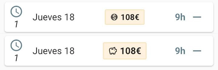
In WorkIO, the earned salary had always been displayed as a plain number, nothing more. It worked, but it was visually flat. So I decided to give it more prominence: creating a dedicated block with an icon to make it more visual and clear.
The intention was purely aesthetic and functional—to improve the user experience without changing the meaning of anything. A design improvement, nothing more. Or so I naively thought.
I chose the dollar symbol $ to accompany the salary figure. My reasoning at first was simple: it’s a symbol commonly associated with money, everyone recognizes it, nobody will misinterpret it.
Wrong.
A communication error I wasn’t aware of until some users started reporting an alleged problem in the application through the support channel: their salary was now being displayed in dollars. I received four or five messages in one week asking the same thing. It might seem like a small number, but in an app with a considerable user base, when several people take the trouble to write, many more will have wondered the same thing without saying anything. I quickly realized this wasn’t a technical bug—it was a communication bug.
For me, it was just an icon. For the user, it was a change in meaning.
I considered the dollar symbol to be something generic that everyone would understand. But in product, interpretation doesn’t depend on intention—it depends on the user’s context. And a symbol isn’t neutral: it carries cultural weight. The $ doesn’t mean “money” to everyone; for many, it means “dollars.”
When the questions started coming in, the first temptation was to explain: “No, no, it’s a generic symbol, it doesn’t mean it’s in dollars.” But that would have been blaming the user for not understanding what the application (ultimately, me) was trying to convey.
The thing is, more often than not, our first instinct is to believe the user is doing something wrong, doesn’t know how to use it, or simply didn’t understand. The real problem was that the product wasn’t clearly communicating its intentions. It wasn’t that users didn’t understand—it was that I hadn’t thought about how they would interpret it. Different context, different reading.
The solution was simple: replace the $ symbol with a piggy bank. An icon that represents money in an abstract way, without associating it with any specific currency. Less explicit, but more universal.
Before settling on the piggy bank, I considered other options: a coins icon (but it was still ambiguous about which currency), or simply the € symbol (but many users aren’t in the eurozone). The piggy bank worked because it represents the concept of ‘saved money’ without committing to any currency.
Sometimes, in product design, being less specific communicates better. You don’t always have to spell everything out; sometimes you need to let the user complete the interpretation from their own frame of reference.
This small incident left me with several lessons that, although I usually apply them with every change I make, often get “forgotten” in the excitement of a new update, the rush, and the lack of experience in a field that isn’t inherently part of development.
Every visual change is a product decision. There’s no such thing as “it’s just an icon” or “it’s just a color”—everything communicates. It’s not enough for something to work; it has to be correctly understood by the people using it.
Before making visual changes, it’s worth asking yourself: if I show this to someone who knows nothing about the app, what would they understand? Not what I want them to understand or what I think they’ll understand, but what they’ll actually understand. Because I know what I meant, but the user only sees what I put there. And that gap between intention and perception is where misunderstandings are born.
I also learned the importance of validating—mentally or with users—before publishing. A moment of reflection can prevent confusion and frustration on the users’ part. And above all, it’s important to learn to listen without justifying. When something isn’t understood, the answer isn’t to explain better; it’s to design and plan better.
We’ve been talking for years about the importance of user experience, user-centered design, and clear communication. But it’s easy to forget all that in day-to-day work, when you’re juggling a thousand things and an icon seems like the most insignificant thing in the world.
It isn’t.
This article isn’t about a poorly chosen icon. It’s about learning to respect how users interpret our product.
If you’re a developer, designer, product manager, or simply someone who builds digital things, I invite you to review your product through this lens: what are you actually communicating? What “small” decisions might be sending a message you never intended?
Because in product, nothing is innocent. And that is precisely the beauty of the craft.
Happy Building!
That may interest you
Managing a software development project is no easy task. Whether you’re working solo, in a small …
read moreQR codes, or “Quick Response Codes”, created in 1994 by Masahiro Hara for the Japanese …
read moreWhat’s urgent isn’t always important, what’s important is almost never permanent. …
read more