Widgets, the cornerstone of Flutter
In the previous chapter, we explored the origins of the Flutter framework, who created it, a bit …
read moreFlutter is a mobile app development framework created by Google that has gained popularity for its ability to build high-quality applications with a single codebase. We have already discussed this in depth here. We have also seen that one of the fundamental pillars of Flutter is its focus on Widgets. In Flutter, everything is a widget. From the simplest text to complex user interfaces, everything is built using Widgets. This greatly simplifies development and provides flexibility for developers. If you are just starting with Flutter, I recommend reading the previous chapters of the series before continuing.
A widget in Flutter is a UI component that describes a part of the interface. They form the basis of an application and can be of different types, such as buttons, texts, images, lists, among others. These not only define the structure and appearance of the interface but also how it behaves and reacts to user interaction.
We have already seen that by default, Flutter distinguishes between two types of widgets: StatelessWidget and StatefulWidget. Now we are going to delve into some of the most common and useful widgets used in Flutter application development to shape and structure our user interface.
In addition to StatelessWidget and StatefulWidget, Flutter provides a wide range of built-in widgets that cover almost all the needs of mobile application development. These can be classified into various categories.
Layout widgets are responsible for organizing and positioning widgets on the screen. Some of the layout widgets along with their most common parameters are:
Row: Organizes its children in a horizontal row.
Column: Organizes its children in a vertical column.
Container: Allows customization of its children’s appearance, such as background color, margin, padding, etc.
Padding: Adds padding to its children.
Center: Centers its children on the screen.
Expanded: Expands its child to fill the available space.
SizedBox: A container that imposes a fixed size on its children.
ListView: Displays a scrollable list of elements.
GridView: Displays a grid of elements.
Stack: Stacks its children on top of each other.
Align: Aligns its child within itself.
Display widgets are responsible for showing information on the screen. Some of the most common display widgets are:
Text: Displays text on the screen. The text to be displayed must be provided as the first parameter.
Image: Renders an image on the screen.
Icon: Displays an icon on the screen.
Card: Presents a card with a shadow and typically rounded corners.
Chip: Displays a label with an icon and text.
Divider: Inserts a dividing line between elements.
Tooltip: Provides an informative pop-up message.
SnackBar: Offers a temporary pop-up message.
CircularProgressIndicator: Indicates progress with a circular indicator.
LinearProgressIndicator: Represents progress linearly.
AppBar: Provides an application bar at the top of the screen.
Drawer: Displays a sliding panel from the edge of the screen.
Dialog: Shows a dialog box that appears above the main content.
AlertDialog: Shows a dialog box above the main content with custom actions. All AlertDialog are Dialog but not all Dialog are AlertDialog.
Action widgets are responsible for handling user interaction. Some of the most common button widgets are:
ElevatedButton: Presents an elevated button with a colored background.
TextButton: Offers a text button without a background.
IconButton: Displays a button with an icon.
FloatingActionButton: Displays a circular floating button.
PopupMenuButton: Displays a pop-up menu.
DropdownButton: Presents a drop-down menu.
OutlinedButton: Offers a button with a border but no background.
Input widgets are responsible for collecting information from the user. Some of the most common input widgets are:
TextField: Allows the user to enter text.
Slider: Displays a sliding control.
Checkbox: Presents a checkbox.
Switch: Displays an on/off switch.
Radio: Provides a radio button.
Form: Groups multiple input fields and provides validation.
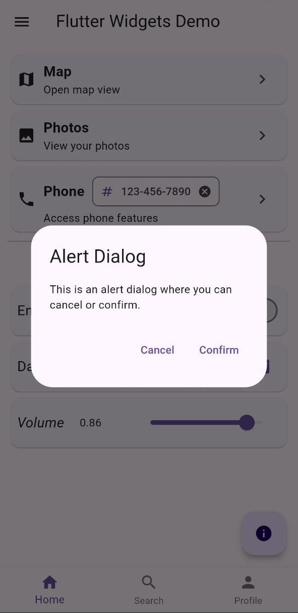
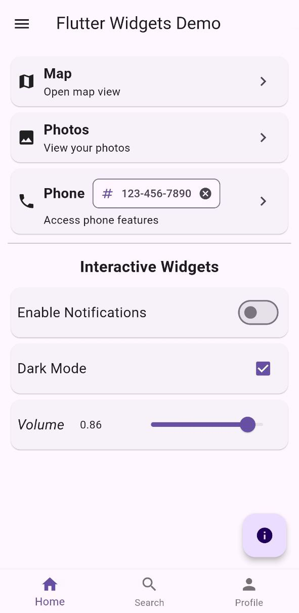
Thanks to all these Widgets and the flexibility provided by Flutter, we can easily build complex and attractive user interfaces for mobile applications with exceptional appearance and functionality. There are many more and they can even be extended with custom widgets created by yourself or by the community. By using just a few of the widgets listed here, you can create something similar to what is shown in the following screenshot. If you want to see the source code, keep reading.
For our example, we are going to combine some of these widgets to build an attractive and functional user interface. In it, we will see several of the different types of widgets we have mentioned so far, such as the Drawer:
Drawer(
child: SizedBox(
height: double.infinity,
width: 200,
child: ListView(
padding: EdgeInsets.zero,
children: <Widget>[
DrawerHeader(
decoration: BoxDecoration(
color: Theme.of(context).primaryColor,
),
child: Text(
'Drawer Header',
style: TextStyle(
color: Colors.white,
fontSize: 24,
),
),
),
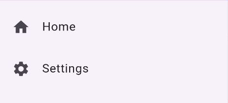
ListTile(
leading: Icon(Icons.home),
title: Text('Home'),
onTap: () {
Navigator.pop(context);
ScaffoldMessenger.of(context).showSnackBar(
SnackBar(
content: Text('Home tapped'),
),
);
},
),
ListTile(
leading: Icon(Icons.settings),
title: Text('Settings'),
onTap: () {
Navigator.pop(context);
ScaffoldMessenger.of(context).showSnackBar(
SnackBar(
content: Text('Settings tapped'),
),
);
},
),
],
),
)
)
In this example, we have used the Drawer widget to display a sliding panel with two items: Home and Settings, as a typical side menu in many mobile applications. When selecting one of the items, a SnackBar with an informative message is shown in our case, but we could navigate to another screen or perform any other action.
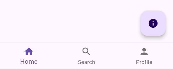
Another noteworthy widget is the FloatingActionButton that appears in the bottom right corner of the screen. This circular floating button is very common in mobile applications and is used for prominent or common actions. In our case, we simply display a dialog when it is pressed:
    FloatingActionButton(
        onPressed: () {
          showDialog(
            context: context,
            builder: (context) {
              return AlertDialog(
                title: Text('Alert Dialog'),
                content: Text('This is an alert dialog where you can cancel or confirm.'),
                actions: [
                  TextButton(
                    onPressed: () {
                      Navigator.pop(context);
                    },
                    child: Text('Cancel'),
                  ),
                  TextButton(
                    onPressed: () {
                      Navigator.pop(context);
                      ScaffoldMessenger.of(context).showSnackBar(
                        SnackBar(
                          content: Text('You are now a new member of the club!'),
                        ),
                      );
                    },
                    child: Text('Confirm'),
                  ),
                ],
              );
            },
          );
        },
        child: Icon(Icons.info),
      )
In the previous example, we see the combination of two widgets to display a dialog with two action buttons after pressing the floating button. For our example, everything is in the same place, but it might be advisable to modularize the code and separate the different elements into different places to maintain a clean and organized structure.
The bottom navigation widget BottomNavigationBar is another common widget in mobile applications. In this case, we have used a BottomNavigationBar with three items: Home, Search, and Profile. When one of the items is selected, the application navigates to a different window, similar to a tab layout but at the bottom of the screen:
    BottomNavigationBar(
        currentIndex: _selectedIndex,
        onTap: _onItemTapped,
        items: const <BottomNavigationBarItem>[
          BottomNavigationBarItem(
            icon: Icon(Icons.home),
            label: 'Home',
          ),
          BottomNavigationBarItem(
            icon: Icon(Icons.search),
            label: 'Search',
          ),
          BottomNavigationBarItem(
            icon: Icon(Icons.person),
            label: 'Profile',
          ),
        ],
      )
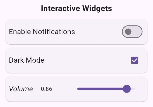
The interactive widgets included in the sample application, such as the Switch, Slider, and Checkbox, are also quite common elements in mobile applications and are used to collect user information. In our source code, each of them is encapsulated in a Card widget to give them a more attractive and organized appearance. The volume control additionally displays the information differently compared to the other two to make the user experience friendlier. While the Switch and Checkbox only have two possible states (on/off), the Slider allows multiple decimal values between 0 and 1, so it wouldn’t make sense to show a Snackbar every time it changes:
    Card(
        child: Padding(
          padding: const EdgeInsets.all(8.0),
          child: Row(
            children: [
              Text('Enable Notifications', style: TextStyle(fontSize: 18)),
              Spacer(),
              Switch(
                value: _isNotificationEnabled,
                onChanged: (bool value) {
                  setState(() {
                    _isNotificationEnabled = value;
                  });
                  ScaffoldMessenger.of(context).showSnackBar(
                    SnackBar(
                      content: Text('Notifications ${value ? 'enabled' : 'disabled'}'),
                    ),
                  );
                },
              ),
            ],
          ),
        ),
      ),
      Card(
        child: Padding(
          padding: const EdgeInsets.all(8.0),
          child: Row(
            children: [
              Text('Dark Mode', style: TextStyle(fontSize: 18)),
              Spacer(),
              Checkbox(
                value: _isDarkModeEnabled,
                onChanged: (bool? value) {
                  setState(() {
                    _isDarkModeEnabled = value ?? false;
                  });
                  ScaffoldMessenger.of(context).showSnackBar(
                      SnackBar(
                        content: Text('Dark Mode ${value ?? false ? 'enabled' : 'disabled'}'),
                      )
                  );
                },
              ),
            ],
          ),
        ),
      ),
      Card(
        child: Padding(
          padding: const EdgeInsets.all(8.0),
          child: Row(
            children: [
              Text('Volume', style: TextStyle(fontSize: 18, fontStyle: FontStyle.italic)),
              SizedBox(width: 20),
              Text(_volumeValue.toStringAsFixed(2)),
              Spacer(),
              Slider(
                value: _volumeValue,
                onChanged: (double value) {
                  setState(() {
                    _volumeValue = value;
                  });
                },
              ),
            ],
          ),
        ),
      ),
And that’s it for this chapter of our Flutter series. I invite you to explore for yourself how we combined some of the widgets mentioned here to shape the user interface of our application. The complete source code is available in our GitHub repository, where you can view it and download it to try it out yourself and make any modifications you see fit. You could start by adding those widgets from the list that have not been integrated into the application and familiarize yourself with those you do not know. If you enjoyed this article and want to continue learning about Flutter and other mobile app development topics, let us know what you think and what you would like to see in future articles. And above all, Happy Coding!
That may interest you
In the previous chapter, we explored the origins of the Flutter framework, who created it, a bit …
read moreFlutter is a mobile app development framework created by Google. It utilizes the Skia rendering …
read morePreviously, we have seen how QR codes work and how they can be used to store specific information to …
read more